In this chapter, we will learn how to use networking concepts and about how large documents can be viewed in chunks. We will cover the following topics:
- Creating a small browser
- Creating a server-side application
- Establishing client-server communication
- Creating a dockable and floatable sign-in form
- Multiple Document Interface
- Displaying information in sections using Tab Widget
- Creating a custom menu bar
Introduction
Space on a device screen is always limited, but sometimes you come across a situation in which you want to display lots of information or services on the screen. In such a situation, you can either use dockable widgets that can be floated anywhere on the screen; MDI to display multiple documents as and when desired; a Tab Widget box to display information in different chunks; or menus to display the required information on the click of a menu item. Also, to better understand networking concepts, you need to understand how clients and servers communicate. This chapter will help you understand all this.
Creating a small browser
Let's now learn a technique to display a web page or the content of an HTML document. We will simply be making use of the Line Edit and Push Button widgets so that the user can enter the URL of the desired site, followed by clicking on the Push Button widget. On clicking the push button, that site will appear in a customized widget. Let's see how.
In this recipe, we will learn how to make a small browser. Because Qt Designer does not includes any widgets specifically, the focus of this recipe is to make you understand how a custom widget can be promoted into QWebEngineView, which in turn can be used for displaying a web page.
The application will prompt for a URL and when the user clicks the Go button after entering the URL, the specified web page will open in the QWebEngineView object.
How to do it...
In this recipe, we will require just three widgets: one for entering the URL, a second for clicking the button, and a third for displaying the website. Here are the steps to creating a simple browser:
- Create an application based on the Dialog without Buttons template.
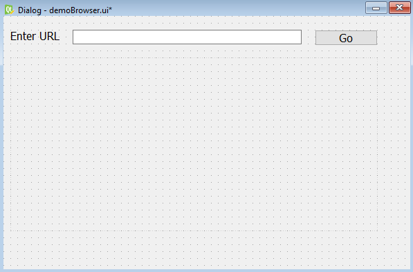
- Add the QLabel, QLineEdit, QPushButton, and QWidget widgets to the form by dragging and dropping Label, Line Edit, Push Button, and WebEngineView onto the form.
- Set the text property of the Label widget to Enter URL.
- Set the text property of the Push Button widget to Go.
- Set the objectName property of the Line Edit widget to lineEditURL, that of the Push Button widget to pushButtonGo and that of the WebEngineView widget to webEngineView.
- Save the application as demoBrowser.ui.
- The user interface created with Qt Designer is stored in a .ui file, which is an XML file, and needs to be converted into Python code.
- To do the conversion, you need to open a Command Prompt window and navigate to the folder where the file is saved, then issue the following command:
C:\Pythonbook\PyQt5>pyuic5 demoBrowser.ui -o demoBrowser.py
You can see the auto-generated Python script file demoBrowser.py in the source code bundle of this book.
- Treat the preceding code as a header file, and import it into the file from which you will invoke its user interface design.
- Let's create another Python file with the name callBrowser.pyw and import the demoBrowser.py code into it:
import sys
from PyQt5.QtCore import QUrl
from PyQt5.QtWidgets import QApplication, QDialog
from demoBrowser import *
class MyForm(QDialog):
    def __init__(self):
        super().__init__()
        self.ui = Ui_Dialog()
        self.ui.setupUi(self)
        self.ui.pushButtonGo.clicked.connect(self.dispSite)
        self.show()
    def dispSite(self):
        self.ui.webEngineView.load(QUrl(self.ui.lineEditURL.text()))
if __name__=="__main__":
    app = QApplication(sys.argv)
    w = MyForm()
    w.show()
    sys.exit(app.exec_())
How it works...
In the demoBrowser.py file, a class with the name of the top-level object is created, with Ui_ prepended. That is, for the top-level object, Dialog, the Ui_Dialog class is created and stores the interface elements of our widget. That class includes two methods, setupUi() and retranslateUi(). The setupUi() method creates the widgets that are used in defining the user interface in Qt Designer. Also, the properties of the widgets are set in this method. The setupUi() method takes a single argument, which is the top-level widget of the application, an instance of QDialog. The retranslateUi() method translates the interface.
In the callBrowser.pyw file, you see that the click() event of the Push Button widget is connected to the dispSite method; after entering a URL in the Line Edit widget, when the user clicks the Push Button, the dispSite method will be invoked.
The dispSite() method invokes the load() method of the WebEngineView class.
The load() method of the QWebEngineView class is supplied with the URL entered in the lineEditURL object consequently, the web page of the specified URL opens up or loads in the QWebEngine widget.
On running the application, you get an empty Line Edit box and a Push Button widget. Enter the desired URL in the Line Edit widget and click on the Go push button, and you will find the web page opens in the QWebEngineView widget, as shown in the following screenshot:

Creating a server-side application
Networking plays a major role in modern life. We need to understand how communication is established between two machines. When two machines communicate, one is usually a server and the other is a client. The client sends requests to the server and the server responds by serving the request made by the client.
In this recipe, we will be creating a client-server application where a connection is established between client and server and each will be able to transfer text messages to the other. That is, two applications will be made and will be executed simultaneously, and the text written in one application will appear in the other.

How to do it...
Let's begin by creating a server application first, as follows:
- Create an application based on the Dialog without Buttons template.
- Add a QLabel, QTextEdit, QLineEdit, and QPushButton to the form by dragging and dropping the Label, a Text Edit, Line Edit, and Push Button widgets on the form.
- Set the text property of the Label widget to Server to indicate that this is the server application.
- Set the text property of the Push Button widget to pushButton.
- Set the objectName property of the Text Edit widget to textEditMessages.
- Set the objectName property of the Line Edit widget to lineEditMessage.
- Set the Push Button widget to pushButtonSend.
- Save the application as demoServer.ui. The form will now appear as shown in the following screenshot:

The user interface created with Qt Designer is stored in a .ui file, which is an XML file, and needs to be converted into Python code. The code of the generated file, demoServer.py,
can be seen in the source code bundle of this book.
How it works...
The demoServer.py file will be treated as a header file and will be imported into another Python file that will use the GUI of the header file and transmit the data from the server to client and vice versa. But before that, let's create a GUI for the client application. The GUI of the client application is exactly the same as that of the server application, with the only difference that the Label widget at the top of this application will display the text Client.
The demoServer.py file is a generated Python script of the GUI widgets that we dragged and dropped onto the form.
To establish a connection between the server and client, we will require a socket object. To create the socket object, you need to supply the following two arguments:
- Socket address: The socket address is represented using certain address families. Each address family requires certain parameters to establish a connection. We will be using the AF_INET address family in this application. The AF_INET address family needs a pair of (host, port) to establish a connection where the parameter, host is the hostname which can either be in string format, internet domain notation, or IPv4 address format and the parameter; port is an integer that represents the port number used for communication.
- Socket type: The socket type is represented through several constants: SOCK_STREAM, SOCK_DGRAM, SOCK_RAW, SOCK_RDM, and SOCK_SEQPACKET. We will use the most generally used socket type, SOCK_STREAM, in this application.
The setsockopt() method is used in the application for setting the value of the given socket option. It includes the following two essential parameters:
- SOL_SOCKET: This parameter is the socket layer itself. It is used for protocol- independent options.
- SO_REUSEADDR: This parameter allows other sockets to bind() to this port unless there is an active listening socket bound to the port already.
You can see in the earlier code that a ServerThread class is created, which inherits the Thread class of Python's threading module. The run() function is overridden where the TCP_IP and TCP_HOST variables are defined and tcpServer is bound with these variables.
Thereafter, the server waits to see whether any client connection is made. For each new client connection, the server creates a new ClientThread inside the while loop. This is because creating a new thread for each client will not block the GUI functionality of the server. Finally, the threads are joined.
Establishing client-server communication
In this recipe, we will learn to make a client and will see how it can send messages to the server. The main idea is to understand how a message is sent, how the server listens to the port, and how communication is established between the two.

How to do it...
To send messages to the server, we will be making use of the Line Edit and Push Button widgets. The message written in the Line Edit widget will be passed to the server on the click of the push button. Here is the step-by-step procedure for creating a client application:
- Create another application based on the Dialog without Buttons template.
- Add QLabel, QTextEdit, QLineEdit, and QPushButton to the form by dragging and dropping the Label, Text Edit, Line Edit, and Push Button widgets on the form.
- Set the text property of the Label widget to Client.
- Set the text property of the Push Button widget to pushButton.
- Set the objectName property of the Text Edit widget to textEditMessages.
- Set the objectName property of the Line Edit widget to lineEditMessage.
- Set the Push Button widget to pushButtonSend.
- Save the application by name as demoClient.ui.
The user interface created with Qt Designer is stored in a .ui file, which is an XML file, and needs to be converted into Python code. The code of the autogenerated file, demoClient.py, can be seen in the source code bundle of this book. To use the GUI created in the demoClient.py file, it needs to be imported into another Python file that will use the GUI and will transmit data from the server to the client and vice versa.
- Create another Python file with the name callServer.pyw and import the demoServer.py code into it. The code in the callServer.pyw script is as shown here:
미완료 -> 서버창 닫힘 문제
QObject::connect: Cannot queue arguments of type 'QTextCursor'
(Make sure 'QTextCursor' is registered using qRegisterMetaType().)
import sys, time
import socket
from PyQt5 import QtGui
from PyQt5 import QtCore
from PyQt5.QtWidgets import QApplication, QDialog
from PyQt5.QtCore import QCoreApplication
from threading import Thread
from socketserver import ThreadingMixIn
from demoServer import *

conn=None

class Window(QDialog):
    def __init__(self):
        super().__init__()
        self.ui = Ui_Dialog()
        self.ui.setupUi(self)
        self.textEditMessages=self.ui.textEditMessages
        self.ui.pushButton.clicked.connect(self.dispMessage)
        self.show()

    def dispMessage(self):
        text=self.ui.lineEditMessage.text()
        global conn
        conn.send(text.encode("utf-8"))
        self.ui.textEditMessages.append("Server: "+self.ui.lineEditMessage.text())
        self.ui.lineEditMessage.setText("")

class ServerThread(Thread):
    def __init__(self,window):
        Thread.__init__(self)
        self.window=window

    def run(self):
        TCP_IP = '0.0.0.0'
        TCP_PORT = 80
        BUFFER_SIZE = 1024
        tcpServer = socket.socket(socket.AF_INET, socket.SOCK_STREAM)
        tcpServer.setsockopt(socket.SOL_SOCKET, socket.SO_REUSEADDR, 1)
        tcpServer.bind((TCP_IP, TCP_PORT))
        threads = []

        tcpServer.listen(4)
        while True:
            global conn
            (conn, (ip,port)) = tcpServer.accept()
            newthread = ClientThread(ip,port,window)
            newthread.start()
            threads.append(newthread)

        for t in threads:
            t.join()


class ClientThread(Thread):

    def __init__(self,ip,port,window):
        Thread.__init__(self)
        self.window=window
        self.ip = ip
        self.port = port


    def run(self):
        while True :
            global conn
            data = conn.recv(1024)
            window.textEditMessages.append("Client: "+data.decode("utf-8"))

if __name__=="__main__":
    app = QApplication(sys.argv)
    window = Window()
    serverThread=ServerThread(window)
    serverThread.start()
    window.exec()
    sys.exit(app.exec_())
How it works...
In the ClientThread class, the run function is overridden. In the run function, each client waits for data received from the server and displays that data in the Text Edit widget. A window class object is passed to the ServerThread class, which passes that object to ClientThread, which, in turn, uses it to access the content written in the Line Edit element.
The received data is decoded because the data received is in the form of bytes, which have to be converted into strings using UTF-8 encoding.
The demoClient.py file that we generated in the preceding section needs to be treated as a header file and needs to be imported into another Python file that will use the GUI of the header file and transmit data from the client to the server and vice versa. So, let's create another Python file with the name callClient.pyw and import the demoClient.py code
into it:
import sys
from PyQt5.QtWidgets import QApplication, QDialog
import socket
from threading import Thread
from socketserver import ThreadingMixIn
from demoClient import *

tcpClientA=None

class Window(QDialog):
    def __init__(self):
        super().__init__()
        self.ui = Ui_Dialog()
        self.ui.setupUi(self)
        self.textEditMessages=self.ui.textEditMessages
        self.ui.pushButton.clicked.connect(self.dispMessage)
        self.show()
    def dispMessage(self):
        text=self.ui.lineEditMessage.text()
        self.ui.textEditMessages.append("Client: "+self.ui.lineEditMessage.text())
        tcpClientA.send(text.encode())
        self.ui.lineEditMessage.setText("")

class ClientThread(Thread):
    def __init__(self,window):
        Thread.__init__(self)
        self.window=window
    def run(self):
        host = socket.gethostname()
        port = 80
        BUFFER_SIZE = 1024
        global tcpClientA
        tcpClientA = socket.socket(socket.AF_INET,socket.SOCK_STREAM)
        tcpClientA.connect((host, port))
        while True:
            data = tcpClientA.recv(BUFFER_SIZE)
            window.textEditMessages.append("Server: "+data.decode("utf-8"))
            tcpClientA.close()

if __name__=="__main__":
    app = QApplication(sys.argv)
    window = Window()
    clientThread=ClientThread(window)
    clientThread.start()
    window.exec()
    sys.exit(app.exec_())
A ClientThread class is a class that inherits the Thread class and overrides the run function. In the run function, you fetch the IP address of the server by invoking the hostname method on the socket class; and, using port 80, the client tries to connect to the server. Once a connection with the server is made, the client tries to receive data from the server inside the while loop.
On receiving the data from the server, the data is converted into string format from byte format and displayed in the Text Edit widget.
We need to run both applications to see client-server communication. On running the callServer.pyw file, you get the output shown on the left side of the following screenshot, and on running the callClient.pyw file, you get the output shown on the right side. Both are same; only the labels at the top distinguish them:

The user can type the text in the Line Edit box at the bottom, followed by pressing the Send button. On pressing the Send button, the text entered in the Line Edit widget will appear in the Text Edit box of both server and client applications. Text is prefixed with Server: to indicate that the text is sent from the server, as shown in the following screenshot:

Similarly, if text is written in the Line Edit widget of the client application followed by pressing the Send button, the text will appear in the Text Edit widget of both applications. The text will be prefixed with Client: to indicate that the text has been sent from the client, as shown in the following screenshot:

Creating a dockable and floatable sign-in form
In this recipe, we will learn to create a sign-in form that will ask for the email address and password of the user for authentication. This sign-in form is different from the usual sign-in form, in the sense that it is a dockable form. That is, you can dock this sign-in form to any of the four sides of the window—top, left, right, and bottom and can even use it as a floatable form. This dockable sign-in form will be created using the Dock widget, so let's get a quick idea about the Dock widget.
Getting ready
To create a detachable set of widgets or tools, you need a Dock widget. A Dock widget is created with the QDockWidget class and is a container that has a title bar and buttons at the top to size it. The Dock widget, which contains a collection of widgets or tools, can be closed, docked in the dock area, or floated and placed anywhere on the desktop. The Dock widget can be docked in different dock areas, such as LeftDockWidgetArea, RightDockWidgetArea, TopDockWidgetArea, and BottomDockWidgetArea. The TopDockWidgetArea dock area is below the toolbar. You can also restrict the dock areas where the Dock widget can be docked. When you do so, the Dock widget can be docked to the specified dock areas only. When a Dock window is dragged out of the dock area, it becomes a free-floating window.
Here are the properties that control the movement of the Dock widget and the appearance of its title bar and other buttons:
| Property | Description |
| DockWidgetClosable | Makes the Dock widget closable. |
| DockWidgetMovable | Makes the Dock widget movable between dock areas. |
| DockWidgetFloatable |
Makes the Dock widget floatable, that is, the Dock widget can be detached from the main window and floated on the desktop. |
| DockWidgetVerticalTitleBar |
Displays a vertical title bar on the left side of the Dock widget. |
| AllDockWidgetFeatures |
It switches on properties such as DockWidgetClosable, DockWidgetMovable, and DockWidgetFloatable, that is, the Dock widget can be closed, moved, or floated. |
| NoDockWidgetFeatures | If selected, the Dock widget cannot be closed, moved, or floated. |
Property Description
DockWidgetClosable Makes the Dock widget closable. DockWidgetMovable Makes the Dock widget movable between dock areas.
DockWidgetFloatable Makes the Dock widget floatable, that is, the Dock widget can be detached from the main window and floated on the desktop. DockWidgetVerticalTitleBar Displays a vertical title bar on the left side of the widget. Dock
It switches on properties such as DockWidgetClosable, AllDockWidgetFeatures DockWidgetMovable, and DockWidgetFloatable, that is, the Dock widget can be closed, moved, or floated. NoDockWidgetFeatures If selected, the Dock widget cannot be closed, moved, or floated.
In order to make a dockable sign-in form for this recipe, we will be making use of the Dock widget and a few more widgets. Let's see the step-by-step procedure for doing this.
How to do it...
Let's make a small sign-in form in the Dock widget that will prompt the user for their email address and password. Being dockable, this sign-in form can be moved anywhere on the screen and can be made floatable. Here are the steps to create this application:
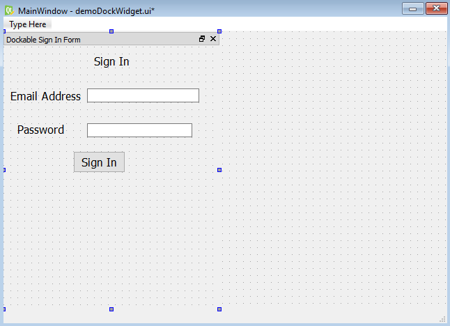
- Launch Qt Designer and create a new Main Window application.
- Drag and drop a Dock widget onto the form.
- Drag and drop the widgets that you want to be available in dock areas or as floating windows in the Dock widget.
- Drag and drop three Label widgets, two Line Edit widgets, and a Push Button widget on the Dock widget.
- Set the text property of the three Label widgets to Sign In, Email Address, and Password.
- Set the text property of the Push Button widget to Sign In.
- We will not set the objectName property of the Line Edit and Push Button widgets and will not provide any code for the Push Button widget, because the purpose of this application is to understand how the Dock widget works.
- Save the application as demoDockWidget.ui.
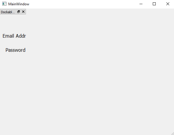
The form will appear as shown in the following screenshot:
- To enable all features in the Dock widget, select it and check its AllDockWidgetFeatures property in the features section of the Property Editor window, as shown in the following screenshot:
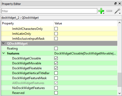
In the preceding screenshot, the AllDockWidgetFeatures property is to make the Dock widget closable, movable in the dock, and floatable anywhere on the Desktop. If the NoDockWidgetFeatures property is selected, then all other properties in the features section are unchecked automatically. That means all buttons will disappear from the Dock widget, and you will not be able to close or move it. If you want the Dock widget to appear as floatable on application startup, check the floating property just above the features section in the Property Editor window.
Look at the following screenshot depicting various features and constraints on the Dock widget:
Perform the following steps to apply the desired features and constraints to the Dock widget:
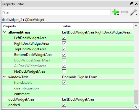
- Check the AllDockWidgetAreas option in the allowedAreas section to enable the Dock widget to be docked in all of the left, right, top, and bottom Dock widget areas.
- Also, by using the windowTitle property in the Property Editor window, set the title of the dock window to Dockable Sign In Form, as shown in the preceding screenshot.
- Check the docked property because it is an essential property to make a Dock widget dockable. If the docked property is not checked, the Dock widget cannot be docked to any of the allowable areas.
- Leave the dockWidgetArea property with its default value, LeftDockWidgetArea. The dockWidgetArea property determines the location where you want the Dock widget to appear as docked when the application is launched. The LeftDockWidgetArea value for the dockWidgetArea property will make the Dock widget first appear as docked in the left Dock widget area. If the NoDockWidgetArea property is set in the allowedAreas section, then all other properties in the allowedAreas section are unselected automatically. Consequently, you can move the Dock window anywhere on the desktop, but you cannot dock it in the dock areas of the Main Window template. The user interface created with Qt Designer is stored in a .ui file, which is an XML file, and needs to be converted into Python code. On the application of the pyuic5 command line utility on the XML file, the generated file is a Python script file, demoDockWidget.py. You can see the code of the generated demoDockWidget.py file in the source code bundle of this book.
- Treat the code in the demoDockWidget.py file as a header file, and import it into the file from which you will invoke its user interface design.
- Create another Python file with the name callDockWidget.pyw and import the demoDockWidget.py code into it:
import sys
from PyQt5.QtWidgets import QMainWindow, QApplication
from demoDockWidget import *
class AppWindow(QMainWindow):
    def __init__(self):
        super().__init__()
        self.ui = Ui_MainWindow()
        self.ui.setupUi(self)
        self.show()
if __name__=="__main__":
    app = QApplication(sys.argv)
    w = AppWindow()
    w.show()
    sys.exit(app.exec_())
How it works...
As you can see in the preceding code, the necessary modules are imported. An AppWindow class is created that inherits from the base class, QMainWindow. The default constructor for QMainWindow is invoked.
Because every PyQt5 application needs an application object, in the preceding code, an application object was created with the name app by invoking the QApplication() method. For passing command line arguments and other external attributes to the application, the sys.argv parameter was passed as a parameter to the QApplication() method. The sys.argv parameter contains command line arguments and other external attributes, if there are any. In order to display the widgets defined in the interface, an instance of the AppWindow class was created with the name w, and the show() method was invoked on it. To exit the application and return the code to Python interpreter that might be used for error handling, the sys.exit() method was called.
When the application is executed, you get a Dock widget that is docked to the left dockable area by default, as shown in the following screenshot. This is because you have assigned the LeftDockWidgetArea value to the dockWidgetArea property of the Dock widget:
The widgets inside the Dock widget are not completely visible, as the default left and dockable areas are narrower than the widgets placed in the Dock widget. So, you can drag the right border of the Dock widget to make all the contained widgets visible, as shown in the following screenshot:

You can drag the widget to any area. If you drag it to the top, it will be docked in the TopDockWidgetArea dock area, as shown in the following screenshot:
Similarly, when the Dock widget is dragged to the right, it will be docked in the RightDockWidgetArea
You can drag the Dock widget outside the Main Window template to make it an independent floating window. The Dock widget will appear as an independent floating window and can be moved anywhere on the desktop:

Multiple Document Interface
In this recipe, we will learn how to create an application that will display more than one document at a time. Not only will we be able to manage more than one document, but we will also learn to arrange the documents in different formats. We will be able to manage more than one document using a concept called Multiple Document Interface, so let's see a quick introduction to this.
Getting ready
Usually, an application provides one document per main window and such applications are said to be Single Document Interface (SDI) applications. As the name suggests, a Multiple Document Interface (MDI) application is able to display several documents. An MDI application consists of a main window along with a menu bar, a toolbar, and a central space. Several documents can be displayed in the central space, where each document can be managed through individual child window widgets; in MDI, several documents can be displayed and each document is displayed in its own window. These child windows are also known as subwindows.
MDI is implemented by making use of the MdiArea widget. The MdiArea widget provides an area where child windows or subwindows are displayed. A subwindow has a title and buttons to show, hide, and maximize its size. Each subwindow can display an individual document. The subwindows can be arranged in a cascade or tile pattern by setting the respective property of the MdiArea widget. The MdiArea widget is an instance of the QMdiArea class and the subwindows are instances of QMdiSubWindow.
Here are the methods provided by QMdiArea:
- subWindowList(): This method returns a list of all subwindows in the MDI area. The returned list is arranged in the order that is set through the WindowOrder() function.
- WindowOrder: This static variable sets the criteria for ordering the list of child windows. Following are the valid values that can be assigned to this static variable:
- CreationOrder: The windows are returned in the order of their creation. This is the default order.
- StackingOrder: The windows are returned in the order in which they are stacked, with the topmost window last in the list.

- ActivationHistoryOrder: The windows are returned in the order in which they were activated.
- activateNextSubWindow(): This method sets the focus to the next window in the list of child windows. The current window order determines the next window to be activated.
- activatePreviousSubWindow(): This method sets the focus to the previous window in the list of child windows. The current window order determines the previous window to be activated.
- cascadeSubWindows(): This method arranges subwindows in cascade fashion.
- tileSubWindows(): This method arranges subwindows in tile fashion.
- closeAllSubWindows(): This method closes all subwindows.
- setViewMode(): This method sets the view mode of the MDI area. The subwindows can be viewed in two modes, SubWindow View and Tabbed View:
- SubWindow View: This method displays subwindows with window frames (default). You can see the content of more than one subwindow if arranged in tile fashion. It is also represented by a constant value, 0.
- Tabbed View: Displays subwindows with tabs in a tab bar. Only the content of one subwindow contents can be seen at a time. It is also represented by a constant value, 1.
How to do it...
Let's create an application that consists of two documents, and each document will be displayed via its individual subwindow. We will learn how to arrange and view these subwindows as desired:
- Launch Qt Designer and create a new Main Window application.
- Drag and drop a MdiArea widget onto the form.
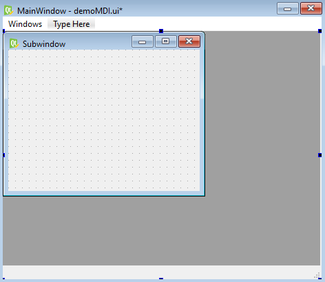
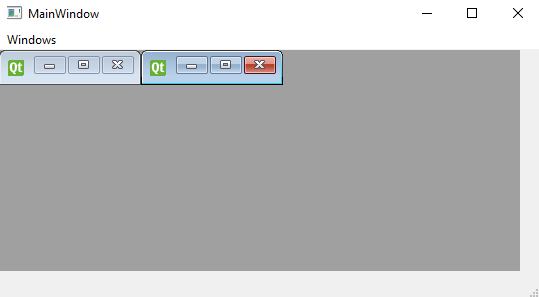
- Right-click on the widget and select Add Subwindow from the context menu to add a subwindow to the MdiArea widget.
When the subwindow is added to the MdiArea widget, the widget appears as the dark background, as shown in the following screenshot:
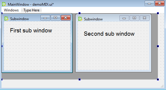
- Let's, right-click again on the MdiArea widget and add one more subwindow to it.
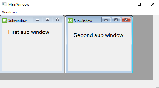
- To know which one is the first and which one is the second subwindow, drag and drop a Label widget onto each subwindow.
- Set the text property of the Label widget placed in the first subwindow to First subwindow.
- Set the text property of the Label widget placed in the second subwindow to Second subwindow, as shown in the following screenshot:
The MdiArea widget displays the documents placed in its subwindows in the following two modes:
- SubWindow View: This is the default view mode. The subwindows can be arranged in cascade or tile fashion in this view mode. When subwindows are arranged in tile fashion, you can see the content of more than one subwindow simultaneously.
- Tabbed View: In this mode, several tabs appear in a tab bar. When a tab is selected, the subwindow associated with it is displayed. Only the content of one subwindow can be seen at a time.
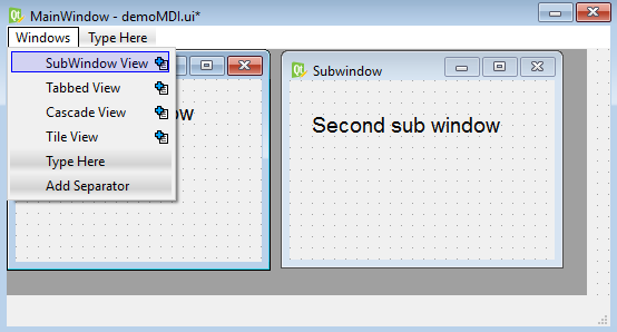
- To activate the SubWindow View and Tabbed View modes through the menu options, double-click the Type Here placeholder in the menu in the menu bar and add two entries to it: SubWindow View and Tabbed View.
Also, to see how the subwindows appear when arranged in cascade and tile fashion, add two more menu items, Cascade View and Tile View, to the menu bar as shown in the following screenshot:
- Save the application as demoMDI.ui. The user interface created with Qt Designer is stored in a .ui file, which is an XML file, and needs to be converted into Python code.On the application of the pyuic5 command line utility, the .ui (XML) file will be converted into Python code:
C:\Pythonbook\PyQt5>pyuic5 demoMDI.ui -o demoMDI.py.
You can see the generated Python code, demoMDI.py, in the source code bundle of this book.
- Treat the code in the demoMDI.py file as a header file, and you will import it to the file from which you will invoke its user interface design. The user interface design in the previous code includes MdiArea to display the subwindows created in it, along with their respective widgets. The Python script that we are going to create will contain the code for the menu options to do different tasks, such as cascading and tiling the subwindows, changing the view mode from SubWindow View to Tabbed View, and vice versa. Let's name that Python script callMDI.pyw and import the demoMDI.py code into it:
import sys
from PyQt5.QtWidgets import QMainWindow, QApplication, QAction, QFileDialog
from demoMDI import *

class MyForm(QMainWindow):
    def __init__(self):
        super().__init__()
        self.ui = Ui_MainWindow()
        self.ui.setupUi(self)
        self.ui.mdiArea.addSubWindow(self.ui.subwindow)
        self.ui.mdiArea.addSubWindow(self.ui.subwindow_2)
        self.ui.actionSubWindow_View.triggered.connect(self.SubWindow_View)
        self.ui.actionTabbed_View.triggered.connect(self.Tabbed_View)
        self.ui.actionCascade_View.triggered.connect(self.cascadeArrange)
        self.ui.actionTile_View.triggered.connect(self.tileArrange)
        self.show()
    def SubWindow_View(self):
        self.ui.mdiArea.setViewMode(0)
    def Tabbed_View(self):
        self.ui.mdiArea.setViewMode(1)
    def cascadeArrange(self):
        self.ui.mdiArea.cascadeSubWindows()
    def tileArrange(self):
        self.ui.mdiArea.tileSubWindows()

if __name__=="__main__":
    app = QApplication(sys.argv)
    w = MyForm()
    w.show()
    sys.exit(app.exec_())
How it works...
In the preceding code, you can see that the two subwindows with the default objectName properties, subwindow and subwindow_2, are added to the MdiArea widget. After that,
the four menu options with objectName properties, actionSubWindow_View, actionTabbed_View, actionCascade_View, and actionTile_View are connected to the four methods SubWindow_View, Tabbed_View, cascadeArrange, and tileArrange respectively. Hence, when the SubWindow View menu option is selected by the user, the SubWindow_View method will be invoked. In the SubWindow_View method, the SubWindow View mode is activated by passing the 0 constant value to the setViewMode method of the MdiArea widget. The SubWindow View displays subwindows with window frames.
Similarly, when the Tabbed View menu option is selected by the user, the Tabbed_View method will be invoked. In the Tabbed_View method, the Tabbed View mode is activated by passing the 1 constant value to the setViewMode method of the MdiArea widget. The Tabbed View mode displays tabs in a tab bar and on clicking a tab, the associated subwindow will be displayed.
When the Cascade View menu option is selected, the cascadeArrange method is invoked, which in turn invokes the cascadeSubWindows method of the MdiArea widget to arrange subwindows in cascade form.
When the Tile View menu option is selected, the tileArrange method is invoked, which in turn invokes the tileSubWindows method of the MdiArea widget to arrange subwindows in tile form.
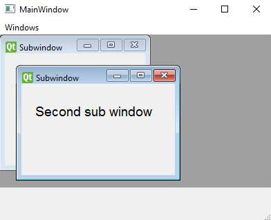
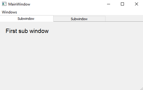
On running the application, the subwindows initially appear in shrunken mode in the MdiArea widget, as shown in the following screenshot. You can see the subwindows along with their titles and minimize, maximize, and close buttons:
You can drag their borders to the desired size. On selecting the first window from the Windows menu, a subwindow becomes active; on selecting the second window, the next subwindow will become active. The active subwindow appears with the brighter title and boundary. In the following screenshot, you can notice that the second subwindow is active. You can drag the boundaries of any subwindow to increase or decrease its size. You can also minimize a subwindow and drag the boundaries of another subwindow to take up the whole width of the MdiArea widget. If you select maximize in any subwindow, it will take up all the space of MdiArea, making other subwindows invisible:
On selecting Cascade, the subwindows are arranged in cascade mode, as shown in the following screenshot. If windows are maximized in Cascade mode, the top subwindow takes up the whole MdiArea widget, hiding other subwindows behind it, as shown in the following screenshot:
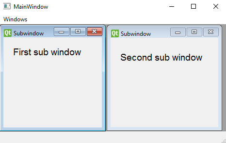
On selecting the Tile button, the subwindows are expanded and tiled. Both subwindows expand equally to cover up the entire workspace, as shown in the following screenshot:
On selecting the Tabbed View button, the MdiArea widget will change from the Subwindow view to Tabbed View. You can select the tab of any subwindow to make it active, as shown in the following screenshot:
Displaying information in sections using Tab Widget
In this application, we will make a small shopping cart that will display certain products for sale in one tab; after selecting the desired products from the first tab, when the user selects the second tab, they will be prompted to enter the preferred payment option. The third tab will ask the user to enter the address for delivering the products.
We will use Tab Widget to enable us to select and fill in the desired information in chunks, so you must be wondering, what is a Tab Widget?
When certain information is divided into small sections, and you want to display the information for the section required by the user, then you need to use Tab Widget. In a Tab Widget container, there are a number of tabs and when the user selects any tab, the information assigned to that tab will be displayed.
How to do it...
Here is the step-by-step procedure to create an application that displays information in chunks using tabs:
- Let's create a new application based on the Dialog without Buttons template.
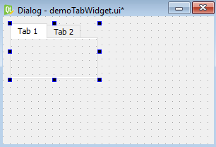
- Drag and drop Tab Widget onto the form. When you drag Tab Widget onto a dialog, it appears with two default tab buttons, labeled Tab1 and Tab2, as shown in the following screenshot:
- You can add more tab buttons to Tab Widget and delete existing buttons if you want by adding a new tab button; right-click on either tab button and select Insert Page from the menu that pops up. You will see two suboptions, After Current Page and Before Current Page.
- Select the After Current Page suboption to add a new tab after the current tab. The new tab will have the default text Page, which you can always change. The application that we are going to make consists of the following three tabs:
- The first tab displays certain products along with their prices. The user can select any number of products from the first tab, followed by clicking the Add to Cart button.
- On selecting the second tab, all the payment options will be displayed. The user can choose to pay via Debit Card, Credit Card, Net Banking, or Cash on Delivery.
- The third tab, when selected, will prompt the user for a delivery address: the complete address of the customer along with state, country, and contact number.
The first task that we will do is to change the default text of the tabs:
- Using the currentTabText property of Tab Widget, change the text displayed on each tab button.
- Set the text property of the first tab button to Product Listing and that of the second tab button to Payment Method.
- To add a new tab button, right-click on the Payment Method tab and select Insert Page from the context menu that appears.
- From the two options that appear, After Current Page and Before Current Page, select After Current Page to add a new tab after the Payment Method tab. The new tab will have the default text Page.
- Using the currentTabText property, change its text to Delivery Address.
- Expand Tab Widget by selecting and dragging its nodes to provide a blank space below the tab buttons, as shown in the following screenshot:
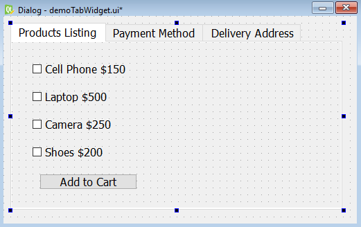
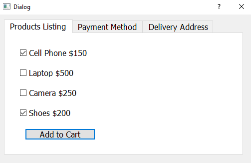
- Select each tab button and drop the desired widgets into the blank space provided. For example, drop four Check Box widgets onto the first tab button, Product Listing, to display the items available for sale.
- Drop a Push Button widget on the form.
- Change the text property of the four checkboxes to Cell Phone $150, Laptop $500, Camera $250, and Shoes $200.
- Change the text property of the Push Button widget to Add to Cart, as shown in the following screenshot:
- Similarly, to provide different payment methods, select the second tab and place four radio buttons in the available space.
- Set the text property of the four radio buttons to Debit Card, Credit Card, Net Banking, and Cash On Delivery, as shown in the following screenshot:

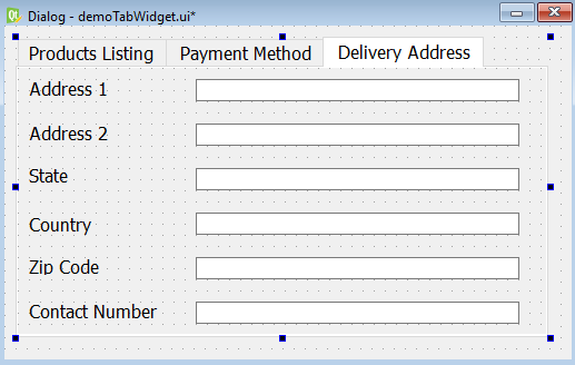
- Select the third tab and drag and drop few Line Edit widgets that prompt the user to provide a delivery address.
- Drag and drop six Label and six Line Edit widgets onto the form.
- Set the text property of the Label widgets to Address 1, Address 2, State, Country, Zip Code, and Contact Number. The Line Edit widgets in front of each Label widget will be used to get the address for delivery, as shown in the following screenshot:
- Save the application as demoTabWidget.ui.
- The user interface created with Qt Designer is stored in a .ui file, which is an XML file, and needs to be converted into Python code. To do the conversion, you need to open a Command Prompt window, navigate to the folder where the file is saved, and issue this command:
C:PythonbookPyQt5>pyuic5 demoTabWidget.ui -o demoTabWidget.py
The code of the generated Python script file, demoTabWidget.py, can be seen in the source code bundle of this book. The user interface design created in the autogenerated code demoTablWidget.py, is used by importing it into another Python script.
- Create another Python file with the name callTabWidget.pyw and import the demoTabWidget.py code into it:
import sys
from PyQt5.QtWidgets import QDialog, QApplication
from demoTabWidget import *
class MyForm(QDialog):
    def __init__(self):
        super().__init__()
        self.ui = Ui_Dialog()
        self.ui.setupUi(self)
        self.show()
if __name__=="__main__":
    app = QApplication(sys.argv)
    w = MyForm()
    w.show()
    sys.exit(app.exec_())
How it works...
As you can see in callTabWidget.pyw, the necessary modules are imported. The MyForm class is created and inherits from the base class, QDialog. The default constructor for QDialog is invoked.
An application object is created with the name app through the QApplication() method. Every PyQt5 application must create an application object. The sys.argv parameter is passed to the QApplication() method while creating the application object. The
sys.argv parameter contains a list of arguments from the command line and helps in passing and controlling the startup attributes of a script. After this, an instance of the MyForm class is created with the name w. The show() method is invoked on the instance, which will display the widgets on the screen. The sys.exit() method ensures a clean exit, releasing memory resources.
When the application is executed, you will find that the first tab, Products Listing, is selected by default and the products available for sale specified in that tab are displayed as shown in the following screenshot:
Similarly, on selecting the other tabs, Payment Method and Delivery Address, you will see the widgets prompting the user to choose the desired payment method and enter a delivery address.
Creating a custom menu bar
A big application is usually broken into small, independent, and manageable modules. These modules can be invoked either by making different toolbar buttons or menu items. That is, we can invoke a module on the click of a menu item. We have seen the File menu, the Edit menu, and so on in different packages, so let's learn to make a custom menu bar of our own.
In this recipe, we will learn to create a menu bar that shows certain menu items. We will learn to add menu items, add submenu items to a menu item, add separators between menu items, add shortcuts and tool tips to menu items, and much more. We will also learn to add actions to these menu items, so that when any menu item is clicked, a certain action will take place.
Our menu bar will consist of two menus, Draw and Edit. The Draw menu will consist of four menu items, Draw Circle, Draw Rectangle, Draw Line, and Properties. The Properties menu item will consist of two submenu items, Page Setup and Set Password. The second menu, Edit, will consist of three menu items, Cut, Copy, and Paste. Let's create a new application to understand how to create this menu bar practically.
How to do it…
We will be following a step-by-step procedure to make two menus, along with the respective menu items in each. For quick access, each menu item will be associated with a shortcut key too. Here are the steps to create our customized menu bar:
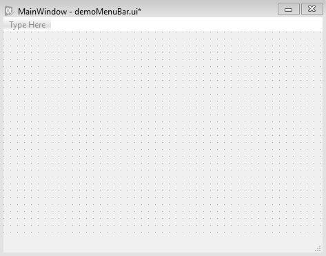
- Launch Qt Designer and create a Main Window template-based application.
You get the new application with the default menu bar because the Main Window template of Qt Designer provides a main application window that displays a menu bar by default. The default menu bar appears as shown in the following screenshot:
- We can always remove the default menu bar by right-clicking in the main window and selecting the Remove Menu Bar option from the context menu that pops up.
- You can also add a menu bar later by selecting the Create Menu Bar option from the context menu.
- Click the placeholder to highlight it and type to modify its text. When you add a menu item, Type Here appears below the new menu item.
- Again, just single left-click the Type Here placeholder to select it and simply type the text for the next menu item.
- You can delete any menu entry by right-clicking it and, from the context menu that pops up, select the option Remove Action action_name.
While writing menu or menu item text, if you add an ampersand character (&) before any character, that character in the menu will appear as underlined and will be treated as a shortcut key. We will also learn how to assign a shortcut key to a menu item later.
- When you create a new menu item by replacing the Type Here placeholders, that menu item will appear as an individual action in the Action Editor box, from where you can configure its properties.
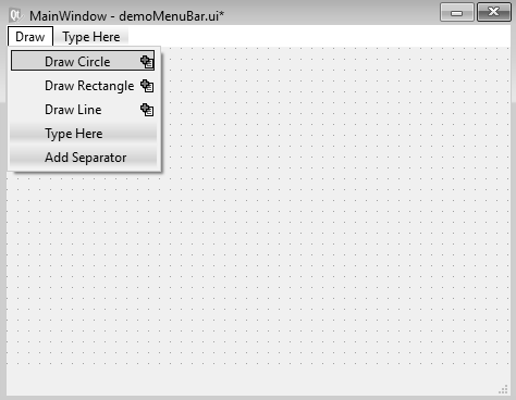
Recall that we want to create two menus in this menu bar with text, Draw and Edit. The Draw menu will have three menu items, Draw Circle, Draw
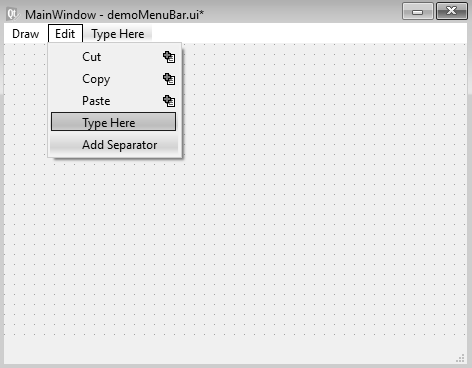
Rectangle, and Draw Line. After these three menu items, a separator will be inserted followed by a fourth menu item called Properties. The Properties menu item will have two submenu items, Page Setup and Set Password. The Edit menu will contain three menu items, Cut, Copy, and Paste.
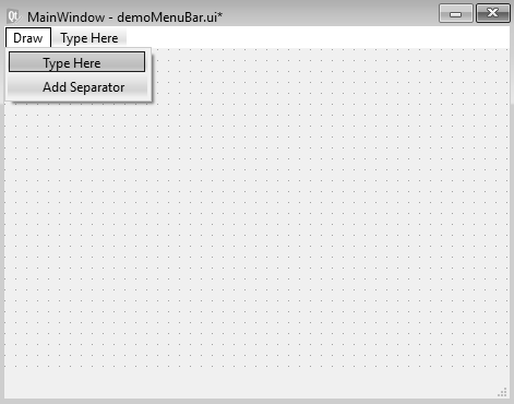
- Double-click the Type Here placeholder and enter the text for the first menu, Draw.
The down arrow key on the Draw menu brings up the Type Here and Add Separator options, as shown in the following screenshot:
- Double-click Type Here and type Draw Circle for the first menu item under the Draw menu. The down arrow key on the Draw Circle menu provides the Type Here and Add Separator options again.
- Double-click Type Here and type Draw Rectangle for the menu item.
- Press the down arrow key to get two options, Type Here and Add Separator.
- Double-click Type Here and type Draw Line for the third menu item.
- On pressing the down arrow key, again you get two options, Type Here and Add Separator, as shown in the following screenshot:
- Select Add Separator to add a separator after the first three menu items.
- Press the down arrow key after the separator and add a fourth menu item, Properties. This is done because we want two submenu items for the Properties menu item.
- Select the right arrow to add submenu items to the Properties menu.
- Press the right arrow key on any menu item to add a submenu item to it. In the submenu item, select Type Here and enter the first submenu, Page Setup.
- Select the down arrow and enter Set Password below the Page Setup submenu item, as shown in the following screenshot:

- The first menu, Draw, is complete. Now, we need to add another menu, Edit. Select the Draw menu and press the right arrow key to indicate that you want to add a second menu to the menu bar.
- Replace Type Here with Edit.
- Press the down arrow and add three menu items, Cut, Copy, and Paste, as shown in the following screenshot:
The actions for all menu items will appear in the Action Editor box automatically, as shown in the following screenshot:

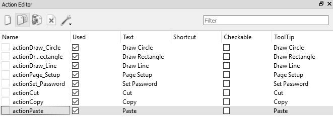
You can see that the action names are generated by prefixing the text action to every menu text and replacing the spaces with underscores. These actions can be used to configure menu items.
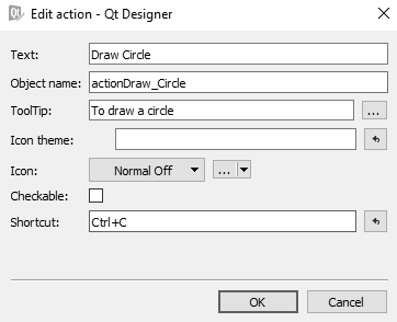
- To add a tooltip message that appears when the user hovers over any menu item, you can use the ToolTip property.
- To assign a tooltip message to the Draw Circle menu item of the Draw menu, select actionDraw_Circle in the Action Editor box and set the ToolTip property to To draw a circle. Similarly, you can assign tooltip messages to all of the menu items.
- To assign a shortcut key to any menu item, open its action from the Action Editor box and click inside the Shortcut box.
- In the Shortcut box, press the key combination that you want to assign to the selected menu item.
For example, if you press Ctrl + C in the Shortcut box, Ctrl+C appears in the box, as shown in the following screenshot:
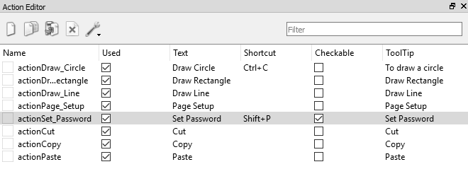
You can have any combination of shortcut keys, such as Shift + key, Alt + key, and Ctrl + Shift + key, for any menu item. The shortcut keys will appear automatically with the menu item in the menu bar. You can also make any menu item checkable, that is, you can make it a toggle menu item.
- To do so, select the action of the desired menu item and check the Checkable checkbox. The actions of each menu item, along with its action name, menu text, shortcut keys, checkable status, and tooltip, appear in the Action Editor box. The following screenshot shows the action of the Set Password submenu item, which confirms that its shortcut key is Shift + P and it is checkable:
- For the Draw Circle, Draw Rectangle, and Draw Line menu items, we will be adding code to draw a circle, draw a rectangle, and draw a line respectively.
- For the rest of the menu items, we want them so that when the user selects any of them, a text message appears on the form indicating which menu item is selected.
- To display a message, drag and drop a Label widget onto the form.
- Our menu bar is complete; save the application with the name demoMenuBar.ui.
- We use the pyuic5 command line utility to convert the .ui (XML) file into Python code.
The generated Python code, demoMenuBar.py, can be seen in the source code bundle of this book.
- Create a Python script with the name callMenuBar.pyw that imports the previous code, demoMenuBar.py, to invoke the menu and display the text message with a Label widget when a menu item is selected.
You want a message to appear that indicates which menu item is selected. Also, you want to draw a circle, rectangle, and line when the Draw Circle, Draw Rectangle, and Draw Line menu items are selected, respectively. The code in the Python callMenuBar.pyw script will appear as shown in the following
screenshot:
import sys
from PyQt5.QtWidgets import QMainWindow, QApplication
from PyQt5.QtGui import QPainter
from demoMenuBar import *
class AppWindow(QMainWindow):
    def __init__(self):
        super().__init__()
        self.ui = Ui_MainWindow()
        self.ui.setupUi(self)
        self.pos1 = [0,0]
        self.pos2 = [0,0]
        self.toDraw=""
        self.ui.actionDraw_Circle.triggered.connect(self.drawCircle)
        self.ui.actionDraw_Rectangle.triggered.connect(self.drawRectangle)
        self.ui.actionDraw_Line.triggered.connect(self.drawLine)
        self.ui.actionPage_Setup.triggered.connect(self.pageSetup)
        self.ui.actionSet_Password.triggered.connect(self.setPassword)
        self.ui.actionCut.triggered.connect(self.cutMethod)
        self.ui.actionCopy.triggered.connect(self.copyMethod)
        self.ui.actionPaste.triggered.connect(self.pasteMethod)
        self.show()
    def paintEvent(self, event):
        qp = QPainter()
        qp.begin(self)
        if self.toDraw=="rectangle":
            width = self.pos2[0]-self.pos1[0]
            height = self.pos2[1] - self.pos1[1]
            qp.drawRect(self.pos1[0], self.pos1[1], width, height)
        if self.toDraw=="line":
            qp.drawLine(self.pos1[0], self.pos1[1], self.pos2[0],self.pos2[1])
        if self.toDraw=="circle":
            width = self.pos2[0]-self.pos1[0]
            height = self.pos2[1] - self.pos1[1]
            rect = QtCore.QRect(self.pos1[0], self.pos1[1], width,height)
            startAngle = 0
            arcLength = 360 *16
            qp.drawArc(rect, startAngle,arcLength)
        qp.end()
    def mousePressEvent(self, event):
        if event.buttons() & QtCore.Qt.LeftButton:
            self.pos1[0], self.pos1[1] = event.pos().x(),event.pos().y()
    def mouseReleaseEvent(self, event):
        self.pos2[0], self.pos2[1] = event.pos().x(),event.pos().y()
        self.update()
    def drawCircle(self):
        self.ui.label.setText("")
        self.toDraw="circle"
    def drawRectangle(self):
        self.ui.label.setText("")
        self.toDraw="rectangle"
    def drawLine(self):
        self.ui.label.setText("")
        self.toDraw="line"
    def pageSetup(self):
        self.ui.label.setText("Page Setup menu item is selected")
    def setPassword(self):
        self.ui.label.setText("Set Password menu item is selected")
    def cutMethod(self):
        self.ui.label.setText("Cut menu item is selected")
    def copyMethod(self):
        self.ui.label.setText("Copy menu item is selected")
    def pasteMethod(self):
        self.ui.label.setText("Paste menu item is selected")

app = QApplication(sys.argv)
w = AppWindow()
w.show()
sys.exit(app.exec_())
How it works...
The triggered() signal of the action of each menu item is connected to its respective method. The triggered() signal of the actionDraw_Circle menu item is connected to the
drawCircle() method, so that whenever the Draw Circle menu item is selected from the menu bar, the drawCircle() method will be invoked. Similarly, the triggered() signal of
the actionDraw_Rectangle and actionDraw_Line menus are connected to the drawRectangle() and drawLine() methods respectively. In the drawCircle() method, the toDraw variable is assigned a string, circle. The toDraw variable will be used to determine the graphics to be drawn in the paintEvent method. The toDraw variable can be assigned any of the three strings, line, circle, or rectangle. A conditional branching is applied to the value in the toDraw variable and the methods to draw a line, rectangle, or circle will be invoked accordingly. The figures will be drawn to the size determined by the mouse, that is, the user needs to click the mouse and drag it to determine the size of the figure.
Two methods, mousePressEvent() and mouseReleaseEvent(), are automatically called when left mouse button is pressed and released respectively. To store the x and y coordinates of the location where the left mouse button was pressed and released, two arrays, pos1 and pos2, are used. The x and y coordinate values of the locations where the left mouse button was pressed and released are assigned to the pos1 and pos2 arrays via the mousePressEvent and mouseReleaseEvent methods.
In the mouseReleaseEvent method, after assigning the x and y coordinate values of the location where the mouse button was released, the self.update method is invoked to invoke the paintEvent() method. In the paintEvent() method, branching takes place on the basis of the string assigned to the toDraw variable. If the toDraw variable is assigned the line string, the drawLine() method will be invoked by the QPainter class to draw the line between the two mouse locations. Similarly, if the toDraw variable is assigned the circle string, the drawArc() method will be invoked by the QPainter class to draw a circle with the diameter supplied by mouse locations. If the toDraw variable is assigned the rectangle string, then the drawRect() method will be invoked by the QPainter class to draw the rectangle of the width and height supplied by the mouse locations.
Besides the three menu items, Draw Circle, Draw Rectangle, and Draw Line, if the user clicks any other menu item, a message will be displayed indicating the menu item clicked on by the user. Hence, the triggered() signals of the rest of the menu items are connected to the methods that display the message information for the menu item that has been selected by the user through a Label widget.
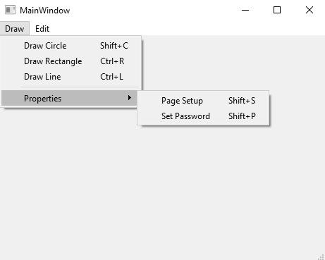
On running the application, you will find a menu bar with two menus, Draw and Edit. The Draw menu will show the four menu items Draw Circle, Draw Rectangle, Draw Line, and Properties, with a separator before the Properties menu item. The Properties menu item shows two submenu items, Page Setup and Set Password, along with their shortcut keys, as shown in the following screenshot:
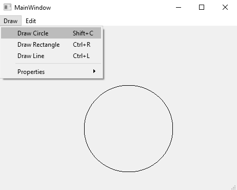
To draw a circle, click on the Draw Circle menu item, click the mouse button at a location on the form, and keeping the mouse button pressed, drag it to define the diameter of the circle. On releasing the mouse button, a circle will be drawn between the mouse pressed and mouse released locations, as shown in the following screenshot:
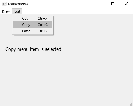
On selecting any other menu item, a message will be displayed, indicating the menu item that is pressed. For example, on selecting the Copy menu item, you get a message, Copy menu item is selected, as shown in the following screenshot:
'Qt5 Python GUI Programming Cookbook' 카테고리의 다른 글
| Database Handling (0) | 2023.02.28 |
|---|---|
| Doing Asynchronous Programming in Python (1) | 2023.02.28 |
| Understanding Dialogs (0) | 2023.02.28 |
| Understanding OOP Concepts (0) | 2023.02.28 |
| Working with Date and Time (0) | 2023.02.28 |


댓글