출처 : 금융 데이터 분석을 위한 파이썬 판다스
금융 데이터 분석을 위한 파이썬 판다스
최근 인공지능 AI(Artificial Intelligence)이 보급화되면서 방대한 양의 데이터를 처리하는 방식이 중요해지기 시작했습니다. 판다스(Pandas)는 오픈 소 ...
wikidocs.net
예제파일
matplotlib 한글 글꼴 사용 설정
from matplotlib import font_manager, rc

# 폰트 경로
font_path = "C:\Windows\Fonts\malgun.ttf"
# 폰트이름 가져오기
font_name = font_manager.FontProperties(fname=font_path).get_name()
# font 설정
rc('font', family=font_name)
권장 설정
import matplotlib.pyplot as plt
import platform

if platform.system() == 'Darwin':
    plt.rc('font', family='AppleGothic')
else:
    plt.rc('font', family='Malgun Gothic')
Plot 방식
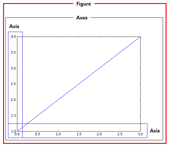
액자 역할을 하는 Figure 타입의 객체와 종이 역할을 하는 AxesSubplot의 객체가 필요
import matplotlib.pyplot as plt

fig = plt.figure()
subplot1 = fig.add_subplot(1, 2, 1) # 1행 2열의 액자에 첫 번째 종이를 만들라는 뜻
subplot2 = fig.add_subplot(1, 2, 2)
subplot1.plot([1, 2, 3, 4])
subplot2.plot([4, 3, 2, 1])
plt.show()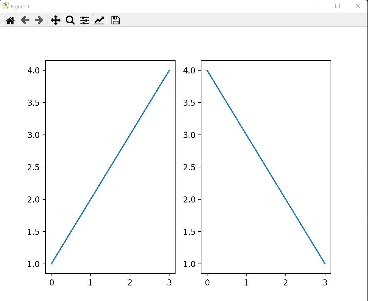
import matplotlib.pyplot as plt

# Figure 객체와 AxesSubplot 객체를 생성하는 두 가지 작업을 한 번에 하고자 할 때
fig, axes = plt.subplots(2, 2)

axes[0][0].plot([1, 2, 3, 4])
axes[0][1].plot([4, 3, 2, 1])
axes[1][0].plot([1, 2, 2, 1])
axes[1][1].plot([2, 1, 1, 2])
plt.show()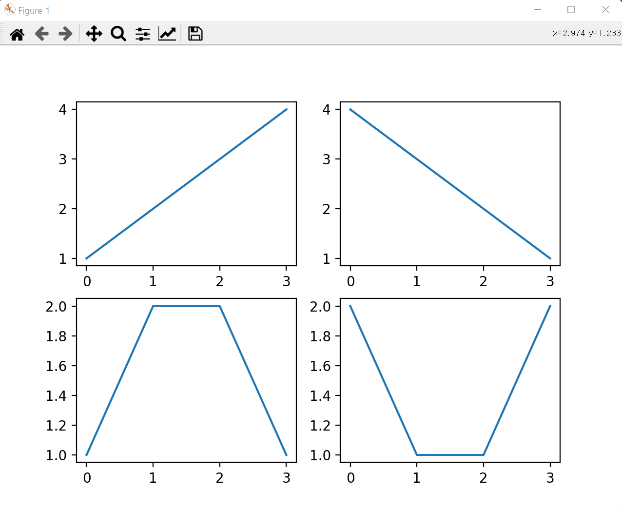
import matplotlib.pyplot as plt

# Figure나 AxesSubplot 객체를 생성하지 않고도 그림을 그릴 때
import matplotlib.pyplot as plt :

plt.plot([1, 2, 3, 4])
plt.show()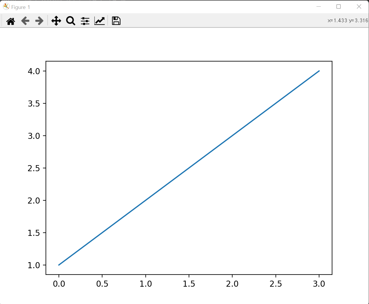
라인(Line) 차트
import matplotlib.pyplot as plt


x = [1, 2, 3, 4]
y = [2, 1, 1, 2]

plt.plot(x,y,label="그래프")           # plot
plt.rc('font', family='malgun gothic') # 한글 글꼴 지정
plt.xlabel("x-axis")                   # x-axis label 설정
plt.ylabel("y-axis")                   # y-axis label 설정
plt.title("title")                     # title 설정
plt.legend(loc="best")                 # 설명문
plt.grid(True,axis="y")                # grid 설정 - 가로방향
plt.rc("axes", unicode_minus=False)    # y축 음수처리
plt.ticklabel_format(axis='y', style='plain')   # 지수로 표현하지 않음
plt.show()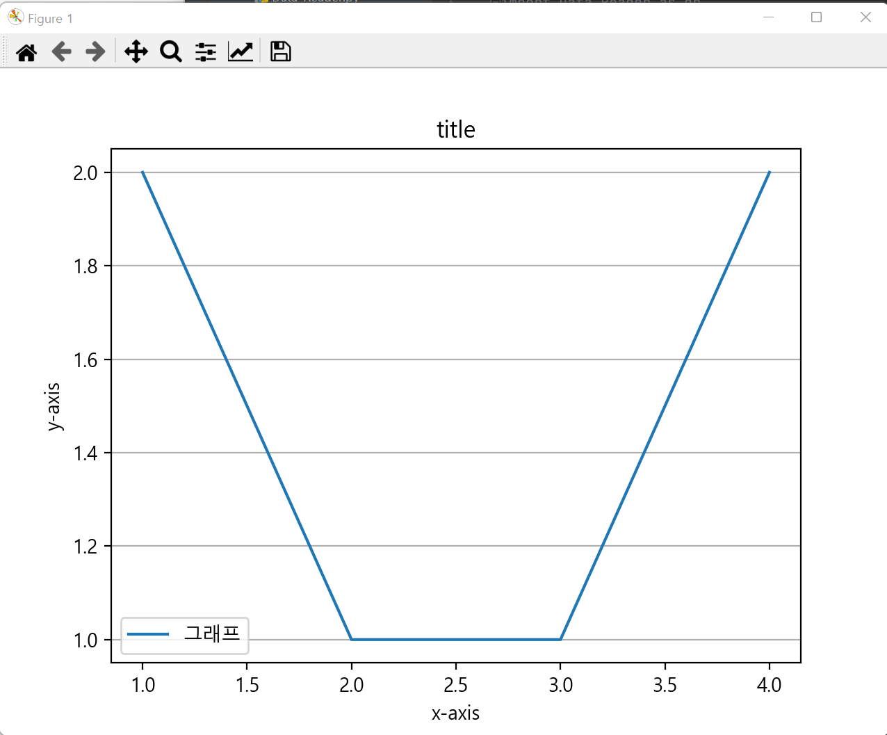
import matplotlib.pyplot as plt

plt.plot([1, 2, 3, 4], [1, 2, 3, 4], label='ascending')
plt.plot([1, 2, 3, 4], [4, 3, 2, 1], label='descending')

plt.legend(loc='best')
plt.show()

import pandas as pd
import matplotlib.pyplot as plt
from matplotlib import font_manager, rc

# 폰트 경로
font_path = "C:\Windows\Fonts\malgun.ttf"
# 폰트이름 가져오기
font_name = font_manager.FontProperties(fname=font_path).get_name()
# font 설정
rc('font', family=font_name)

kospi = pd.read_excel("DB/kospi.xlsx", index_col="Date")
print(kospi)


fig = plt.figure(figsize=(14, 6))
ax = fig.add_subplot(1, 1, 1)
ax.plot(kospi['Close'])

ax.set_xlabel("날짜")
ax.set_ylabel("코스피지수")
ax.set_title("2019년 이후 코스피지수")
plt.grid(True, axis='y')
plt.show()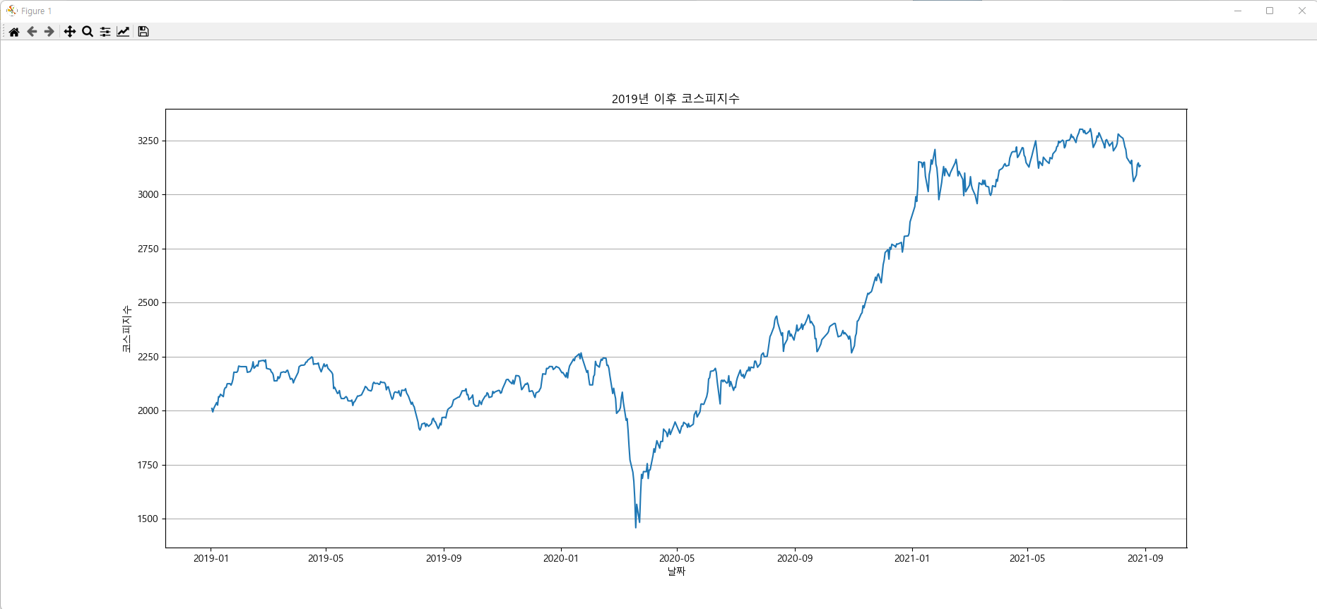
# 두 개의 행으로 멀티 컬럼을 구성
df = pd.read_excel("DB/loan.xlsx", index_col=0, header=[0, 1])
print(df.head())
전년동월비(%)기준년월 대출고객수 대출잔액
전체 1금융권 2금융권 전체 1금융권 2금융권
'21.06 7.1 8.5 5.9 6.7 9.8 3.3
'21.05 8.1 9.7 6.8 7.9 11.4 4.0
'21.04 4.8 5.6 4.2 5.3 8.5 1.9
'21.03 5.1 6.3 4.2 5.1 8.6 1.3
'21.02 5.1 6.6 3.9 5.0 9.0 0.8
대출잔액 = df['대출잔액']
대출잔액 = 대출잔액[::-1]  # 대출잔액.sort_index(inplace=True)
print(대출잔액.head())
전체 1금융권 2금융권
'20.06 2.3 7.4 -2.7
'20.07 2.0 6.9 -2.8
'20.08 2.3 7.4 -2.7
'20.09 2.1 6.6 -2.4
'20.10 0.6 8.5 -7.2
fig = plt.figure(figsize=(12, 8))
plt.plot(대출잔액.index, 대출잔액["전체"], marker='o', label="전체")
plt.plot(대출잔액.index, 대출잔액["1금융권"], marker='o', label="1금융권")
plt.plot(대출잔액.index, 대출잔액["2금융권"], marker='o', label="2금융권")

plt.rc("axes", unicode_minus=False) # y축 음수처리
plt.ylabel("(전년동월비,%)")
plt.legend()
plt.grid(True, axis='y')
plt.show()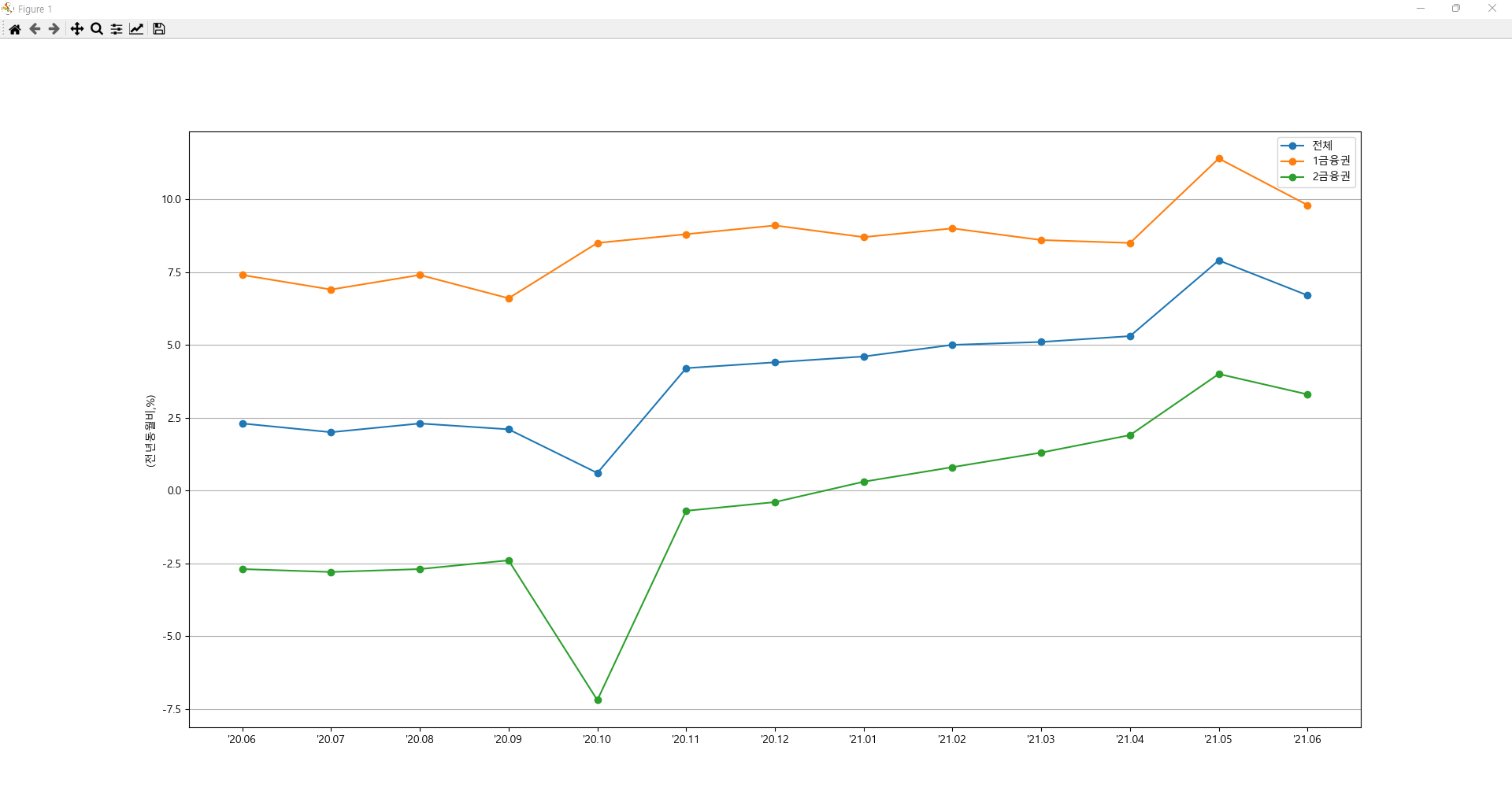
막대(Bar) 차트
세로막대 : subplot.bar(x=x축_데이터, height=y축_데이터, width=0.5(bar너비), color='skyblue')
가로막대 : subplot.barh(y=y축_데이터, width=x축_데이터, height=0.5(bar너비), color='#F88878')
import matplotlib.pyplot as plt

x = [1, 2, 3, 4]
y = [2, 1, 1, 2]

plt.bar(x,y)
plt.show()
import pandas as pd
import matplotlib.pyplot as plt

plt.rc('font', family='malgun gothic')

kospi = pd.read_excel("DB/kospi.xlsx", index_col='Date')
kospi2020 = kospi.loc["2020"]
mean_kospi_2020 = kospi2020.resample('MS').mean()
print(mean_kospi_2020)

fig = plt.figure(figsize=(15, 8))
ax = fig.add_subplot(1, 1, 1)
month = [x.strftime("%Y-%m") for x in mean_kospi_2020.index]
ax.bar(x=month, height=mean_kospi_2020['Volume'], width=0.5, color='skyblue')

plt.ticklabel_format(axis='y', style='plain')   # 지수로 표현하지 않음
plt.title("KOSPI 월별 평균 거래량 (2020년)")
plt.xlabel("월")
plt.ylabel("평균 거래량")

plt.show()
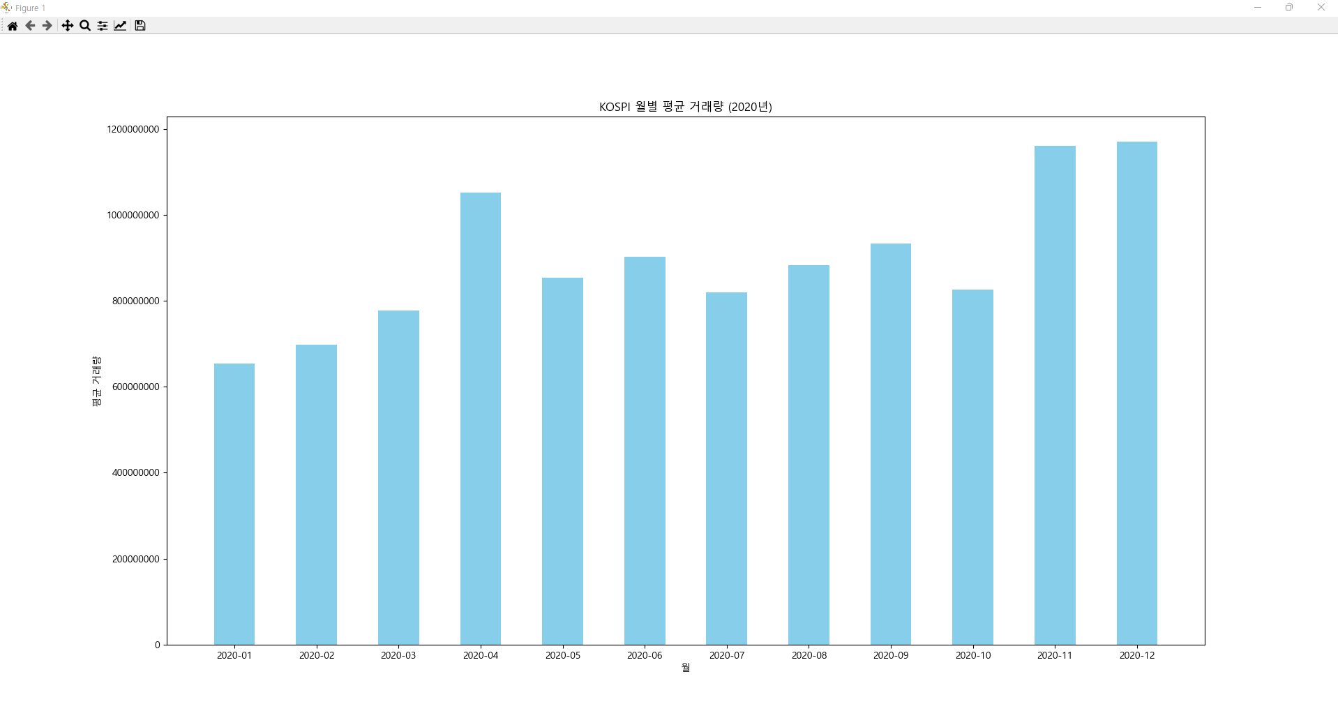
fig = plt.figure(figsize=(15, 8))
ax = fig.add_subplot(1, 1, 1)
month = [x.strftime("%Y-%m") for x in mean_kospi_2020.index]
ax.barh(y=month[::-1], width=mean_kospi_2020['Volume'][::-1], height=0.5, color='#F88878')

plt.ticklabel_format(axis='x', style='plain')   # 지수로 표현하지 않음
plt.title("KOSPI 월별 평균 거래량 (2020년)")
plt.ylabel("월")
plt.xlabel("평균 거래량")
plt.show()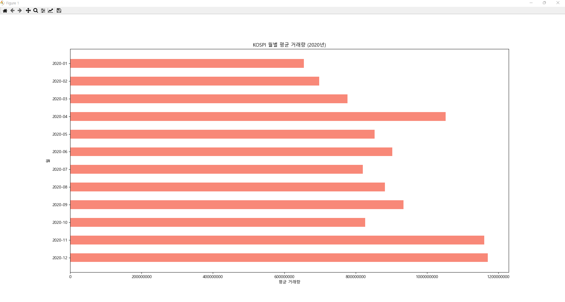
히스토그램
import matplotlib.pyplot as plt

plt.rc('font', family='malgun gothic')

data = [1, 2, 2, 3, 3, 3, 4, 4, 4, 4]   # 1이 1개, 2가 2개, 3이 3개, 4가 4개
plt.hist(data)
plt.show()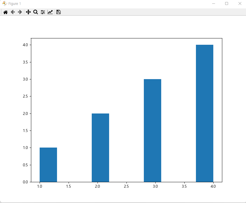
# hist 함수는 입력 데이터를 구간으로 나눈 후 각 구간의 빈도수를 계산
# bins 파라미터로 값을 전달하지 않으면 데이터를 10개의 구간으로 나눔
# hist 함수는 튜플 객체를 리턴 - 빈도수(n), 구간(bins), 패치(patches) 정보
import matplotlib.pyplot as plt

data = range(100)   # 0~99
(n, bins, patches) = plt.hist(data)

print(n)  # 빈도 : [10. 10. 10. 10. 10. 10. 10. 10. 10. 10.]
print(bins) # 구간 : [ 0.   9.9 19.8 29.7 39.6 49.5 59.4 69.3 79.2 89.1 99. ]
print(patches)  # patch정보 : <BarContainer object of 10 artists>

plt.show()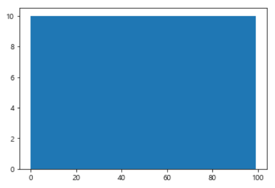
코스피 지수 데이터를 사용해서 일간 변동률
# 변동률(오늘)=((오늘종가-어제종가)/어제종가)×100
kospi = pd.read_excel("DB/kospi.xlsx", index_col='Date')
print(kospi.head())

n, bins, patches = plt.hist(x=kospi['Change'] * 100, bins=20)
plt.grid()
plt.show()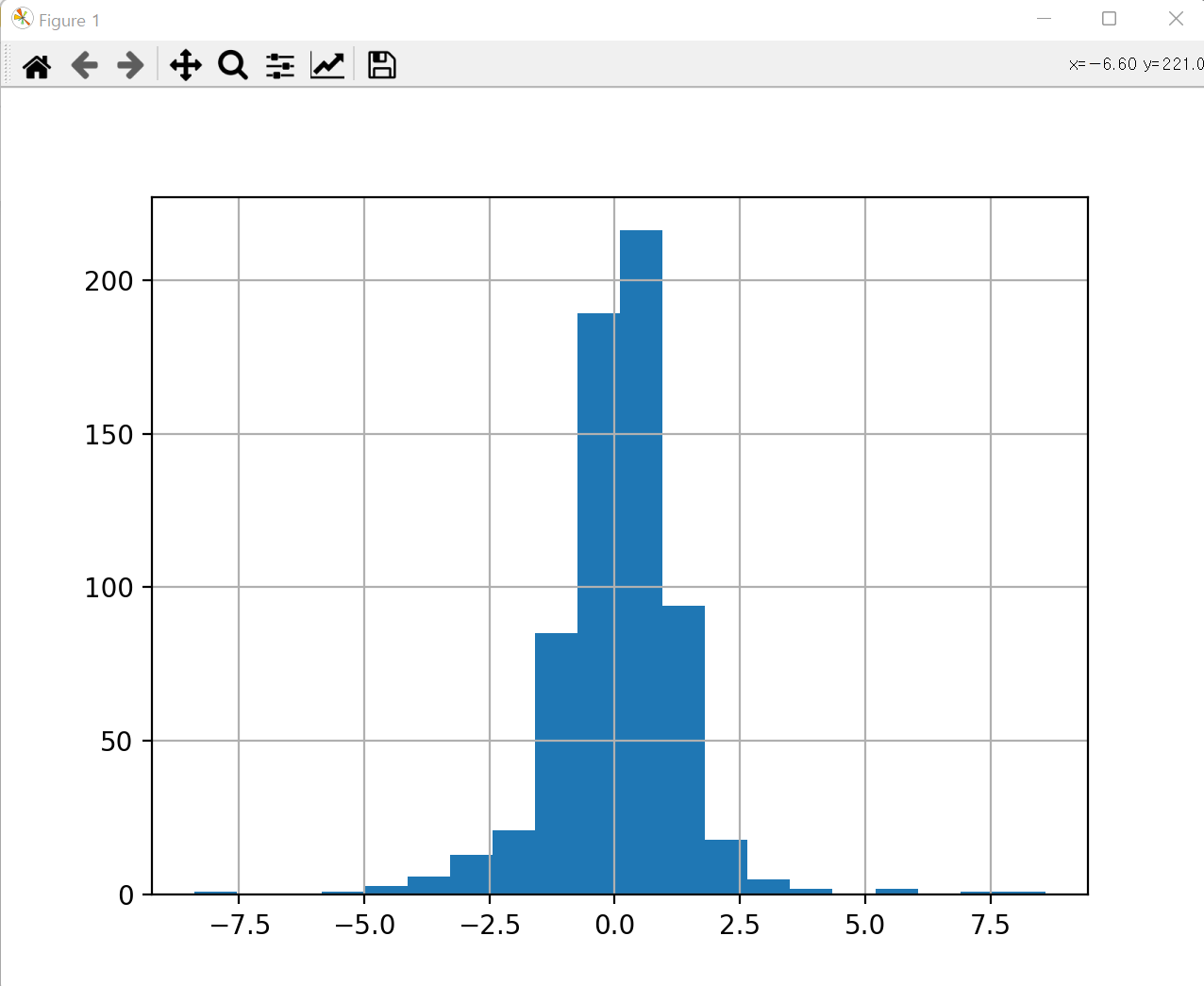
지수화
일반적으로 지수화에서는 비교 구간의 첫 번째 값을 100으로 설정하고 나머지 값들의 스케일을 조정
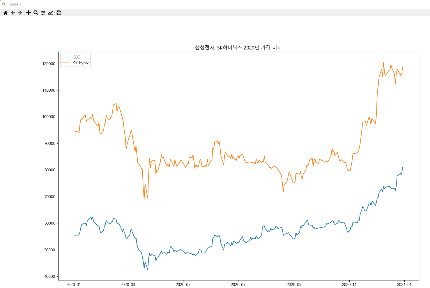
import matplotlib.pyplot as plt

plt.rc('font', family='malgun gothic')

sec = pd.read_excel("DB/sec.xlsx", index_col="Date")
skhynix = pd.read_excel("DB/skhynix.xlsx", index_col="Date")

sec_index = (sec['Close'] / sec['Close'][0]) * 100
skhynix_index = (skhynix['Close'] / skhynix['Close'][0]) * 100

fig = plt.figure(figsize=(12, 8))
ax = fig.add_subplot(1, 1, 1)
ax.plot(sec.index, sec_index, label="SEC")
ax.plot(sec.index, skhynix_index, label="SK hynix")
plt.ylabel("가격지수")
plt.title("삼성전자, SK하이닉스 2020년 가격 비교")
plt.legend()
plt.show()
캔들 차트
mplfinance 모듈을 추가로 설치 필요
import mplfinance as mpf
print(mpf.__version__) # 0.12.8b9
import pandas as pd
import matplotlib.pyplot as plt
import mplfinance as mpf
df = pd.read_excel("DB/sec.xlsx", index_col=0)
print(df.head())
mpf.plot(data=df.loc["2020-12"], type='candle')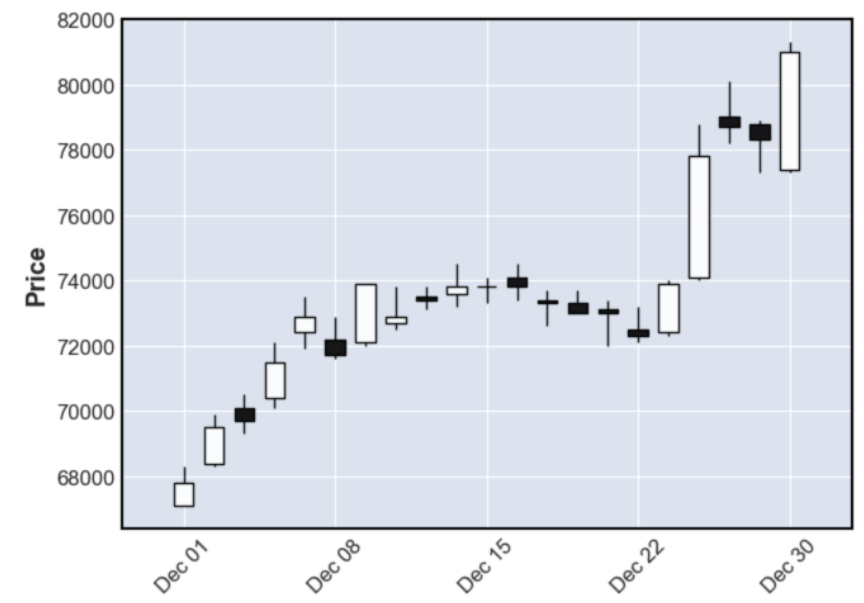
# 사용 가능 스타일 확인
styles = mpf.available_styles()
print(styles)
# ['binance', 'blueskies', 'brasil', 'charles', 'checkers',
# 'classic', 'default', 'ibd', 'kenan', 'mike', 'nightclouds',
# 'sas', 'starsandstripes', 'yahoo']
import pandas as pd
import matplotlib.pyplot as plt
import mplfinance as mpf
df = pd.read_excel("DB/sec.xlsx", index_col=0)
print(df.head())
mc = mpf.make_marketcolors(
up="r",
down="b",
edge="inherit", # 캔들의 몸통색
wick="inherit" # 캔들의 머리/꼬리색
)
s = mpf.make_mpf_style(
base_mpf_style="starsandstripes",
marketcolors=mc,
gridaxis='both', # horizontal, vertical, both
y_on_right=True # False는 y축을 왼쪽에 표시
)
mpf.plot(data=df.iloc[:60], type='candle', style=s, figratio=(13, 6))
import pandas as pd
import matplotlib.pyplot as plt
import mplfinance as mpf


df = pd.read_excel("DB/sec.xlsx", index_col=0)
print(df.head())

mc = mpf.make_marketcolors(
    up="r",
    down="b",
    edge="inherit",   # 캔들의 몸통색
    wick="inherit",   # 캔들의 머리/꼬리색
    volume="inherit"  # 거래량 색상
)

s = mpf.make_mpf_style(
    base_mpf_style="starsandstripes",
    marketcolors=mc,
    gridaxis='both',   # horizontal, vertical, both
    y_on_right=True    # False는 y축을 왼쪽에 표시
)

mpf.plot(
    data=df.iloc[:60],
    type='candle',
    style=s,
    figratio=(13, 6),
    volume=True,      # 거래량이 같이 출력
    scale_width_adjustment=dict(volume=0.8, candle=1) # 일봉과 거래량 그래프의 너비를 조정(기본값 : 1)
)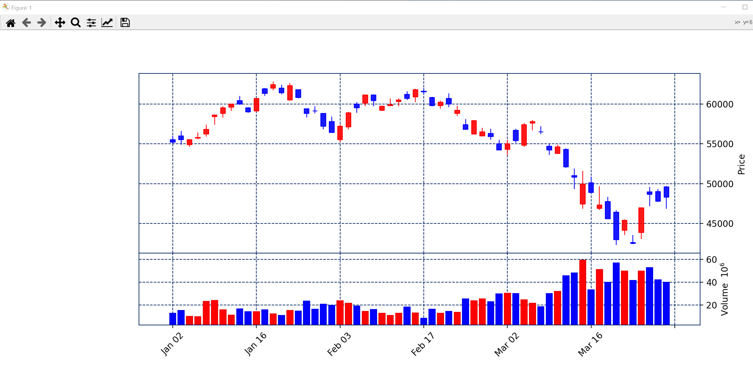
mpf.plot(
    data=df.iloc[:60],
    type='candle',
    mav=(5, 20),  # moving average
    style=s,
    figratio=(13, 6),
    volume=True,      # 거래량이 같이 출력
    scale_width_adjustment=dict(volume=0.8, candle=1) # 일봉과 거래량 그래프의 너비를 조정(기본값 : 1)
)
import pandas as pd
import platform
import matplotlib.pyplot as plt

# 한글처리
if platform.system() == 'Darwin':
    plt.rc('font', family='AppleGothic')
else:
    plt.rc('font', family='Malgun Gothic')

kospi = pd.read_excel("DB/kospi.xlsx", index_col=0, usecols=[0, 1, 2])
df = kospi.head()
print(df)

kospi.plot()  # subplot 생성
plt.show()
Close Open
Date
2019-01-02 2010.00 2050.55
2019-01-03 1993.70 2011.81
2019-01-04 2010.25 1992.40
2019-01-07 2037.10 2034.24
2019-01-08 2025.27 2038.68

kospi.plot.line()
plt.show()
kospi.plot(kind='line')
plt.show()s = kospi.pct_change(axis=1)
print(s) Close Open
Date
2019-01-02 NaN 0.020174
2019-01-03 NaN 0.009084
2019-01-04 NaN -0.008879
2019-01-07 NaN -0.001404
2019-01-08 NaN 0.006621
... ... ...
2021-08-23 NaN -0.001100
2021-08-24 NaN -0.005927
2021-08-25 NaN 0.000419
2021-08-26 NaN 0.007278
2021-08-27 NaN -0.005619
upward     = kospi['Open']  < kospi['Close']
stationary = kospi['Open'] == kospi['Close']
downward   = kospi['Open']  > kospi['Close']

kospi.loc[upward,     'category'] = "상승"
kospi.loc[stationary, 'category'] = "보합"
kospi.loc[downward,   'category'] = "하락"

how = {
    "category": len
}
data = kospi.groupby('category').agg(how)
print(data)
category
category
상승 333
하락 325
data.plot.bar(legend=False)
plt.show()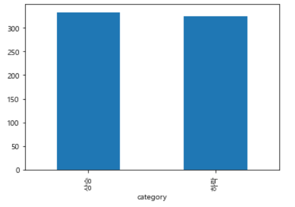
댓글