Mathworks에서 개발되어 공학이나 과학 분야에서 자주 사용되는 프로그래밍 언어로 매트랩(MATLAB)이 있습니다. 매트랩은 공학 및 과학 문제 해결에 최적화된 프로그래밍 환경으로서 다양한 분야에서 활용되고 있습니다.
matplotlib의 pyplot 모듈은 매트랩과 비슷한 형태로 그래프를 그리는 기능을 제공합니다. 참고로 앞장에서 그린 그래프에는 pyplot 모듈을 사용했습니다. pyplot 모듈만 제대로 익혀도 왠만한 데이터는 모두 효과적으로 도식화할 수 있습니다.
import matplotlib.pyplot as plt

plt.plot([1, 2, 3, 4])
plt.show()
import matplotlib.pyplot as plt

x = range(0, 100)
y = [v * v for v in x]

# 색상+라인타입
# 색상 : b-blue, r-red, g-green, c-cyan, m-magenta, y-yello, k-black, w-white
# 라인타입 : o 원, -- 대시, s 사각형, ^ 삼각형, v 역 삼각형, + 십자형, . 점
plt.plot(x, y)
# plt.plot(x, y,'ro')
# plt.plot(x, y,'r--')
# plt.plot(x, y,'rs')
# plt.plot(x, y,'r^')
# plt.plot(x, y,'rv')
# plt.plot(x, y,'r+')
# plt.plot(x, y,'r.')

plt.show()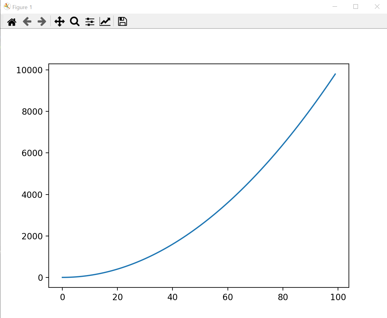
Figure와 subplots
한 화면에 여러 개의 그래프를 그리려면 figure 함수를 통해 Figure 객체를 먼저 만든 후 add_subplot 메서드를 통해 그리려는 그래프 개수만큼 subplot을 만들면 됩니다.
import matplotlib.pyplot as plt

x = range(0, 20)
y = [v * v for v in x]

fig = plt.figure()
ax1 = fig.add_subplot(4, 2, 1) # 2행1열 배열의 1번째 plot
ax2 = fig.add_subplot(4, 2, 2)
ax3 = fig.add_subplot(4, 2, 3)
ax4 = fig.add_subplot(4, 2, 4)
ax5 = fig.add_subplot(4, 2, 5)
ax6 = fig.add_subplot(4, 2, 6)
ax7 = fig.add_subplot(4, 2, 7)
ax8 = fig.add_subplot(4, 2, 8)

ax1.plot(x, y)
ax2.plot(x, y,'ro')
ax3.plot(x, y,'r--')
ax4.plot(x, y,'rs')
ax5.plot(x, y,'r^')
ax6.plot(x, y,'rv')
ax7.plot(x, y,'r+')
ax8.plot(x, y,'r.')

plt.show()
import matplotlib.pyplot as plt
import numpy as np
x = np.arange(0.0, 2*np.pi, 0.1) # (시작점, 끝점, 간격)
print(x)

sin_y = np.sin(x)
cos_y = np.cos(x)

fig = plt.figure()
ax1 = fig.add_subplot(2, 1, 1)
ax2 = fig.add_subplot(2, 1, 2)

ax1.plot(x, sin_y, 'b--')
ax2.plot(x, cos_y, 'r--')

plt.show()
라벨 및 범례 표시하기
import numpy as np
import matplotlib.pyplot as plt

x = np.arange(0.0, 2 * np.pi, 0.1)
sin_y = np.sin(x)
cos_y = np.cos(x)

fig = plt.figure()
ax1 = fig.add_subplot(211)
ax2 = fig.add_subplot(212)

ax1.plot(x, sin_y, 'b--')
ax2.plot(x, cos_y, 'r--')

ax1.set_xlabel('x')
ax1.set_ylabel('sin(x)')

ax2.set_xlabel('x')
ax2.set_ylabel('cos(x)')

plt.show()
import numpy as np
import matplotlib.pyplot as plt
import pandas_datareader.data as web

lg = web.DataReader("066570.KS", "yahoo")
samsung = web.DataReader("005930.KS", "yahoo")

plt.plot(lg.index, lg['Adj Close'], label='LG Electronics')
plt.plot(samsung.index, samsung['Adj Close'], label='Samsung Electronics')
plt.legend(loc=0)
# 범례 위치
# ‘best’ 0,‘upper right’ 1,‘upper left’    2,‘lower left’ 3,‘lower right’    4,‘right’ 5,‘
# center left’ 6,‘center right’ 7,‘lower center’ 8,‘upper center’ 9,‘center’ 10


plt.show()
matplotlib 구성

import matplotlib.pyplot as plt

fig = plt.figure()
print(type(fig))   # <class 'matplotlib.figure.Figure'>
ax = fig.add_subplot(1, 1, 1)
print(type(ax))    # <class 'matplotlib.axes._subplots.AxesSubplot'>
fig, ax_list = plt.subplots(2, 2)

for i in [0,1]:
    for j in [0,1]:
        ax_list[i][j].plot([1,2,3,4])

plt.show()
수정 종가와 거래량 한번에 그리기
import matplotlib.pyplot as plt
import pandas_datareader.data as web

sk_hynix = web.DataReader("000660.KS", "yahoo")

fig = plt.figure(figsize=(12, 8))   # Figure 객체의 크기를 조정

# subplot2grid는 subplot의 위치나 크기를 조절할 때 사용
# subplot2grid(grid 모양, 해당 grid 시작점, rowspan - grid가 행 방향으로 걸치는 크기, colspan-rid가 열 방향으로 걸치는 크기)
top_axes = plt.subplot2grid((4,4), (0,0), rowspan=3, colspan=4)
bottom_axes = plt.subplot2grid((4,4), (3,0), rowspan=1, colspan=4)
# 거래량 값으로서 큰 값이 발생할 때 그 값을 오일러 상수(e)의 지수 형태로 표현
bottom_axes.get_yaxis().get_major_formatter().set_scientific(False)

top_axes.plot(sk_hynix.index, sk_hynix['Adj Close'], label='Adjusted Close')
bottom_axes.plot(sk_hynix.index, sk_hynix['Volume'])

# tight_layout 함수는 subplot들이 Figure 객체의 영역 내에서 자동으로 최대 크기로 출력되게 해줍니다.
plt.tight_layout()
plt.show()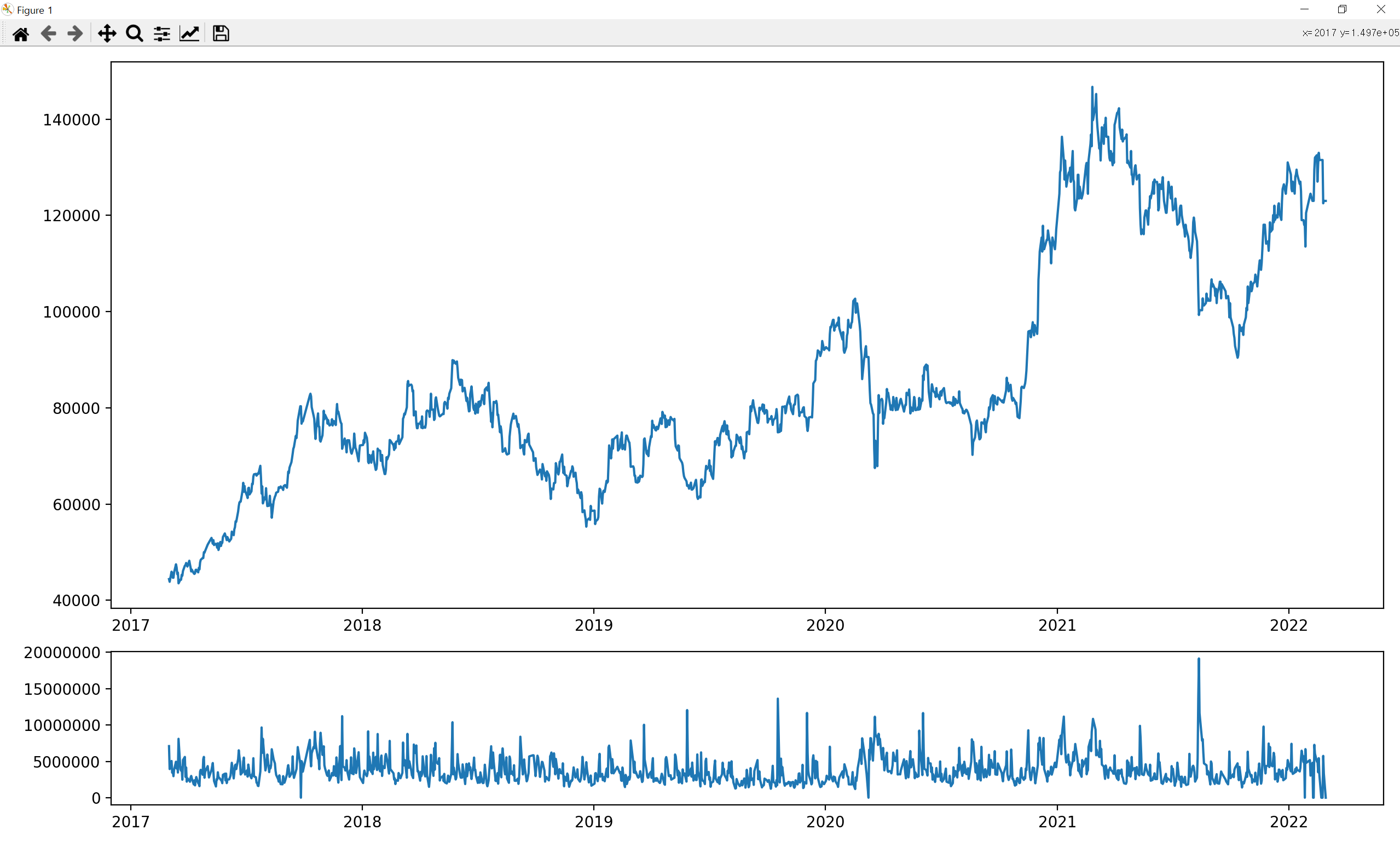
캔들 스틱 차트 그리기
import pandas_datareader.data as web
import datetime
import matplotlib.pyplot as plt
import mpl_finance
import matplotlib.ticker as ticker

start = datetime.datetime(2022, 1, 1)
end = datetime.datetime(2022, 3, 3)
skhynix = web.DataReader("000660.KS", "yahoo", start, end)
skhynix = skhynix[skhynix['Volume'] > 0]
fig = plt.figure(figsize=(12, 8))

ax = fig.add_subplot(111)

day_list = []
name_list = []
for i, day in enumerate(skhynix.index):
    if day.dayofweek == 0:
        day_list.append(i)
        name_list.append(day.strftime('%Y-%m-%d') + '(Mon)')

ax.xaxis.set_major_locator(ticker.FixedLocator(day_list))  # 위치를 설정하는 함수
ax.xaxis.set_major_formatter(ticker.FixedFormatter(name_list)) # 출력되는 값을 설정하는 함수

mpl_finance.candlestick2_ohlc(ax, skhynix['Open'], skhynix['High'], skhynix['Low'], skhynix['Close'], width=0.5, colorup='r', colordown='b')
plt.show()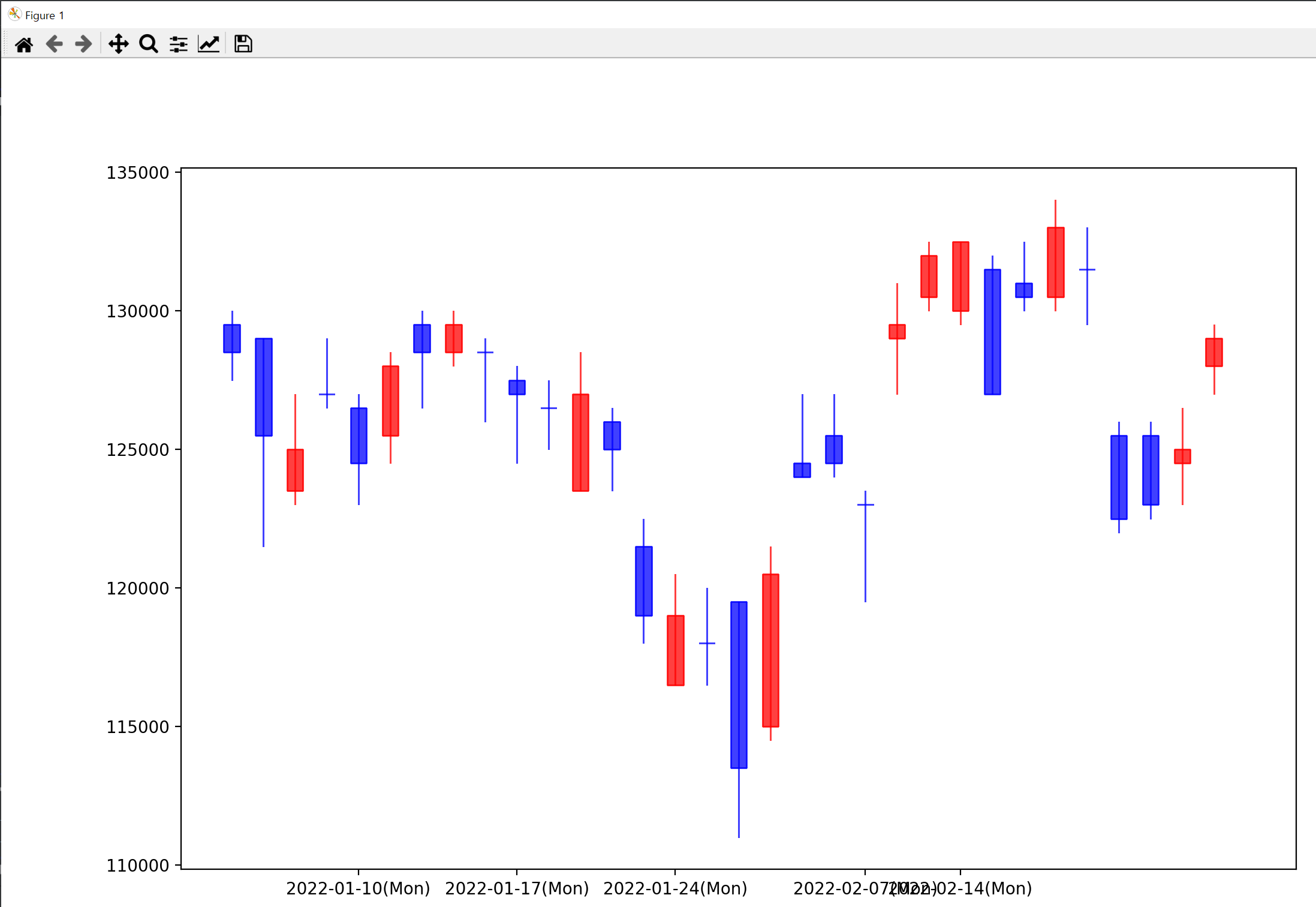
bar 차트 그리기
import matplotlib.pyplot as plt
import numpy as np
from matplotlib import font_manager, rc   # 한글 폰트를 설정
from matplotlib import style

font_name = font_manager.FontProperties(fname="c:/Windows/Fonts/malgun.ttf").get_name()
rc('font', family=font_name)
style.use('ggplot')

industry = ['통신업', '의료정밀', '운수창고업', '의약품', '음식료품', '전기가스업', '서비스업', '전기전자', '종이목재', '증권']
fluctuations = [1.83, 1.30, 1.30, 1.26, 1.06, 0.93, 0.77, 0.68, 0.65, 0.61]

fig = plt.figure(figsize=(12, 8))
ax = fig.add_subplot(111)

ypos = np.arange(10)
rects = plt.barh(ypos, fluctuations, align='center', height=0.5)  # (위치, bar에 대한 수치, align: bar 정렬 위치,height: 수평 bar 차트의 높이)
plt.yticks(ypos, industry)   # y축에 ticker를 표시

for i, rect in enumerate(rects):
    ax.text(0.95 * rect.get_width(), rect.get_y() + rect.get_height() / 2.0, str(fluctuations[i]) + '%', ha='right', va='center')

plt.xlabel('등락률')
plt.show()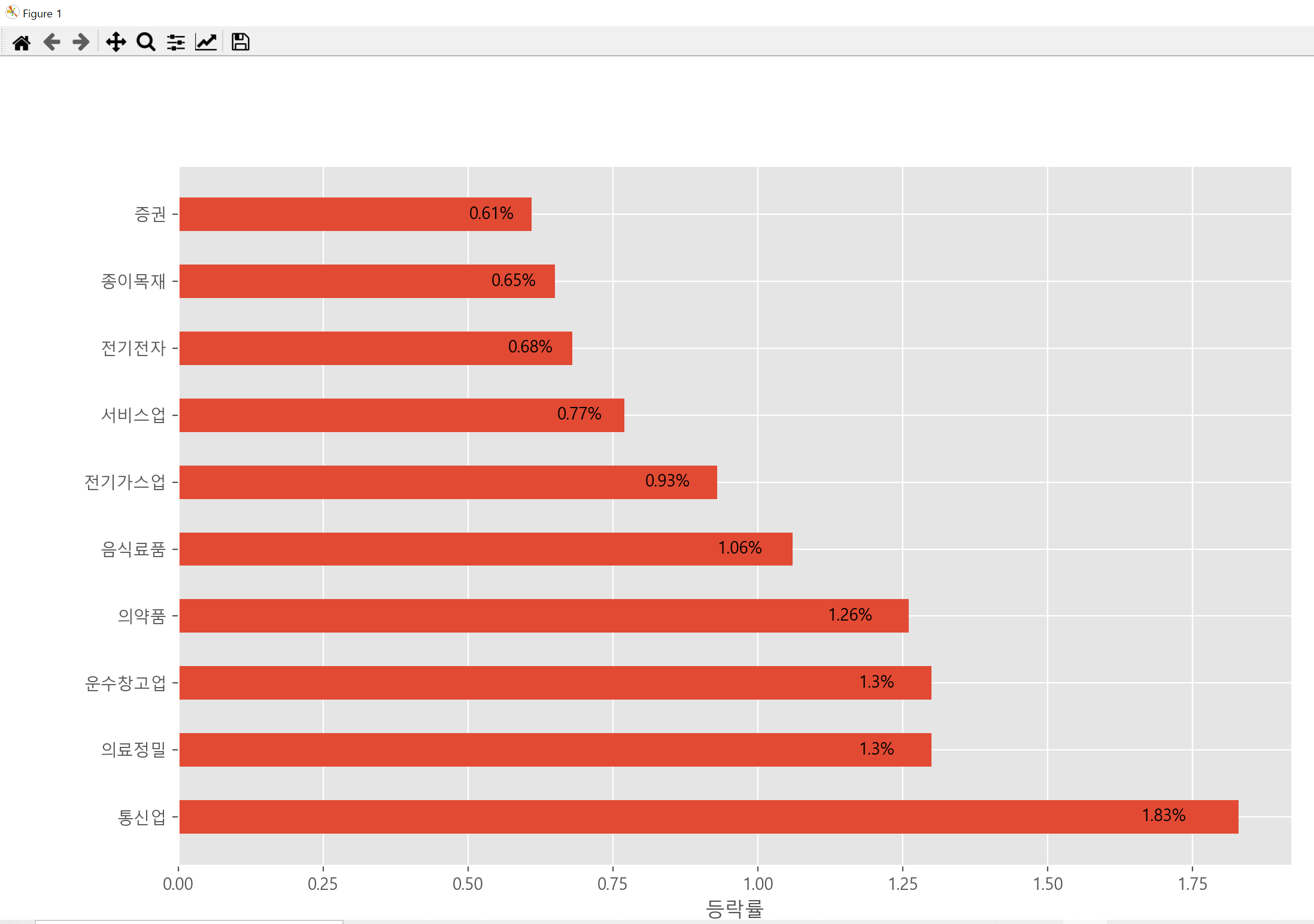
pie 차트 그리기
import matplotlib.pyplot as plt
import numpy as np
from matplotlib import font_manager, rc   # 한글 폰트를 설정
from matplotlib import style

font_name = font_manager.FontProperties(fname="c:/Windows/Fonts/malgun.ttf").get_name()
rc('font', family=font_name)
style.use('ggplot')

colors = ['gold', 'yellowgreen', 'lightcoral', 'lightskyblue', 'red']
labels = ['삼성전자', 'SK하이닉스', 'LG전자', '네이버', '카카오']
ratio = [50, 20, 10, 10, 10]
explode = (0.0, 0.1, 0.0, 0.0, 0.0)

plt.pie(ratio, explode=explode, labels=labels, colors=colors, autopct='%1.1f%%', shadow=True, startangle=90)
plt.show()
댓글